Lecture 20
Correlation between numerical variables

ABD 3e Chapter 16

Chris Merkord

Learning objectives

  • Define correlation as the association between two numerical variables
  • Interpret the sign and magnitude of Pearson’s correlation coefficient \(r\)
  • Explain why correlation does not imply causation
  • Interpret confidence intervals and hypothesis tests for correlation
  • Use scatterplots to assess assumptions and detect common violations
  • Explain how restricted range and measurement error can weaken observed correlations
  • Identify when Spearman rank correlation or a correlation matrix is appropriate

Correlation between two numerical variables

  • Correlation describes the strength and direction of association between two numerical variables
    • Positive correlation: \(X \uparrow,\ Y \uparrow\)
    • Negative correlation: \(X \uparrow,\ Y \downarrow\)
  • Measured with a correlation coefficient, often denoted \(r\)
  • Based on the pattern of scatter in a scatter plot
  • Correlation describes association, not how steeply one variable changes

Example: body mass and brain mass in mammals

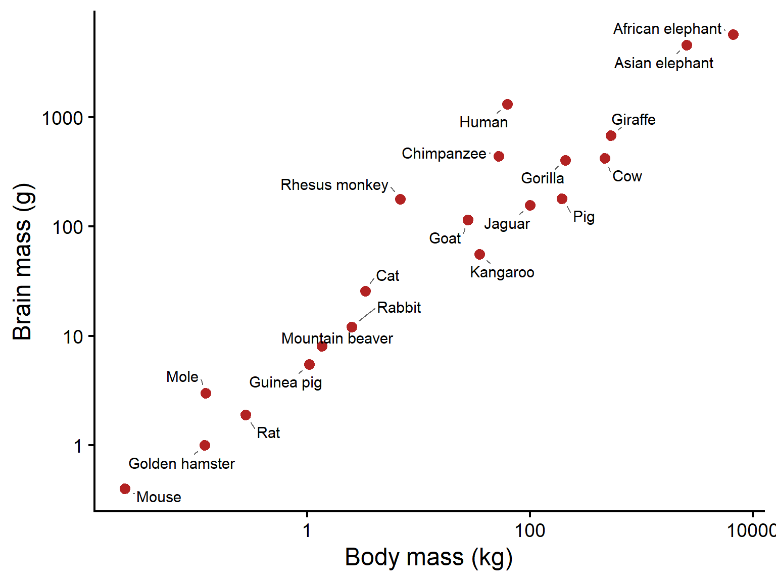
  • Each point represents one mammal species
  • Species with larger body mass tend to have larger brain mass
  • This is a positive correlation: \(X \uparrow,\ Y \uparrow\)
  • The relationship is strong, but not perfect
  • Some species have larger or smaller brains than expected for their body size
Scatterplot of mammal body mass on the x-axis and brain mass on the y-axis, both on logarithmic scales. Points represent species and are labeled with names such as human, chimpanzee, elephant, whale, rat, and mole. Larger mammals generally have larger brains.
Figure 1: Brain mass versus body mass for selected mammals. Each point is a species from the R MASS package Animals dataset (Venables & Ripley 2002). Data shown on logarithmic axes.

Correlation does not imply causation

  • A correlation means two variables are associated, not that one causes the other
  • X may affect Y, Y may affect X, or both may be influenced by a third variable
  • Coincidental correlations can also occur by chance
  • Correlation alone cannot establish cause-and-effect relationships
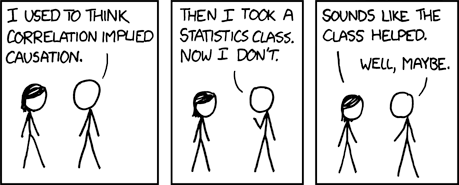
Figure 2: Image: xkcd (CC BY-NC 2.5)

Direction of correlation

  • Positive correlation: as one variable increases, the other tends to increase
  • Negative correlation: as one variable increases, the other tends to decrease
  • The sign of the correlation describes the direction of association
  • Direction does not tell us how strong the relationship is
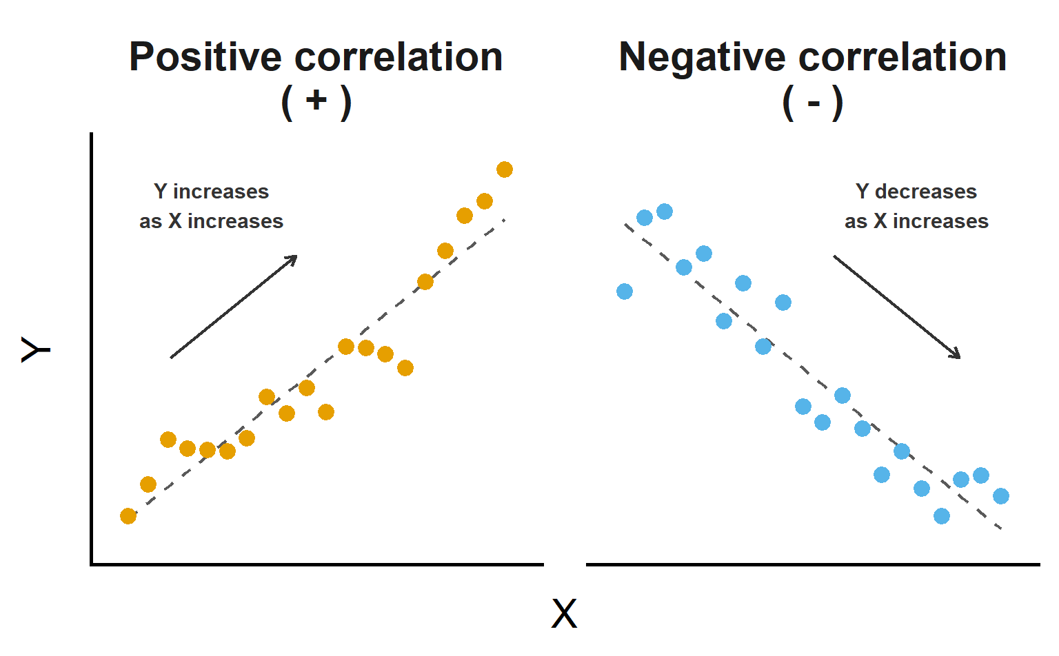
Two-panel scatterplot. Left panel shows an upward trend representing positive correlation. Right panel shows a downward trend representing negative correlation.
Figure 3: Examples of positive and negative correlation.

Strength of correlation

  • Strength describes how closely the points follow a linear trend
    • Stronger correlation: points cluster tightly around a line
    • Weaker correlation: points show more scatter around the line
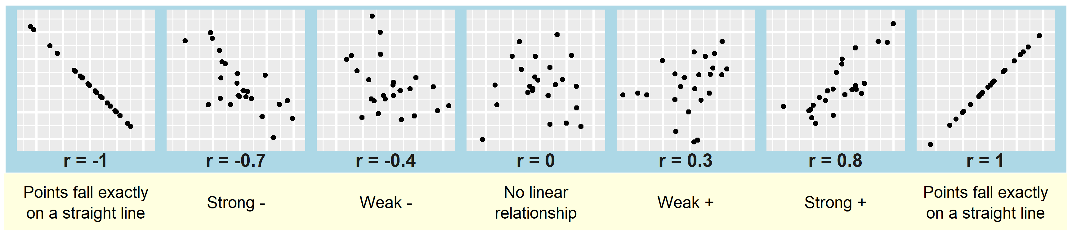
Seven-panel figure of scatterplots arranged from strong negative to strong positive relationships. The left panels show negative correlations, with points sloping downward from weak to perfect negative. The middle panel shows no linear relationship. The right panels show positive correlations, with points sloping upward from weak to perfect positive. Stronger relationships have less scatter around a line.
Figure 4: Examples of negative, zero, and positive correlations ranging from weak to strong linear relationships. Stronger relationships show points clustered more closely around a straight-line trend.

Linear correlation coefficient \(r\)

  • Measures the strength and direction of association between two numerical variables
  • Population corr. = \(\rho\) , sample corr. = \(r\)
  • Based on paired deviations from X and Y means
  • Points in the upper-right and lower-left quadrants contribute positive correlation
  • Values range from \(-1\) to \(+1\)

\[ r = \frac{\sum (X_i-\bar{X})(Y_i-\bar{Y})} {\sqrt{\sum (X_i-\bar{X})^2 \sum (Y_i-\bar{Y})^2}} \]
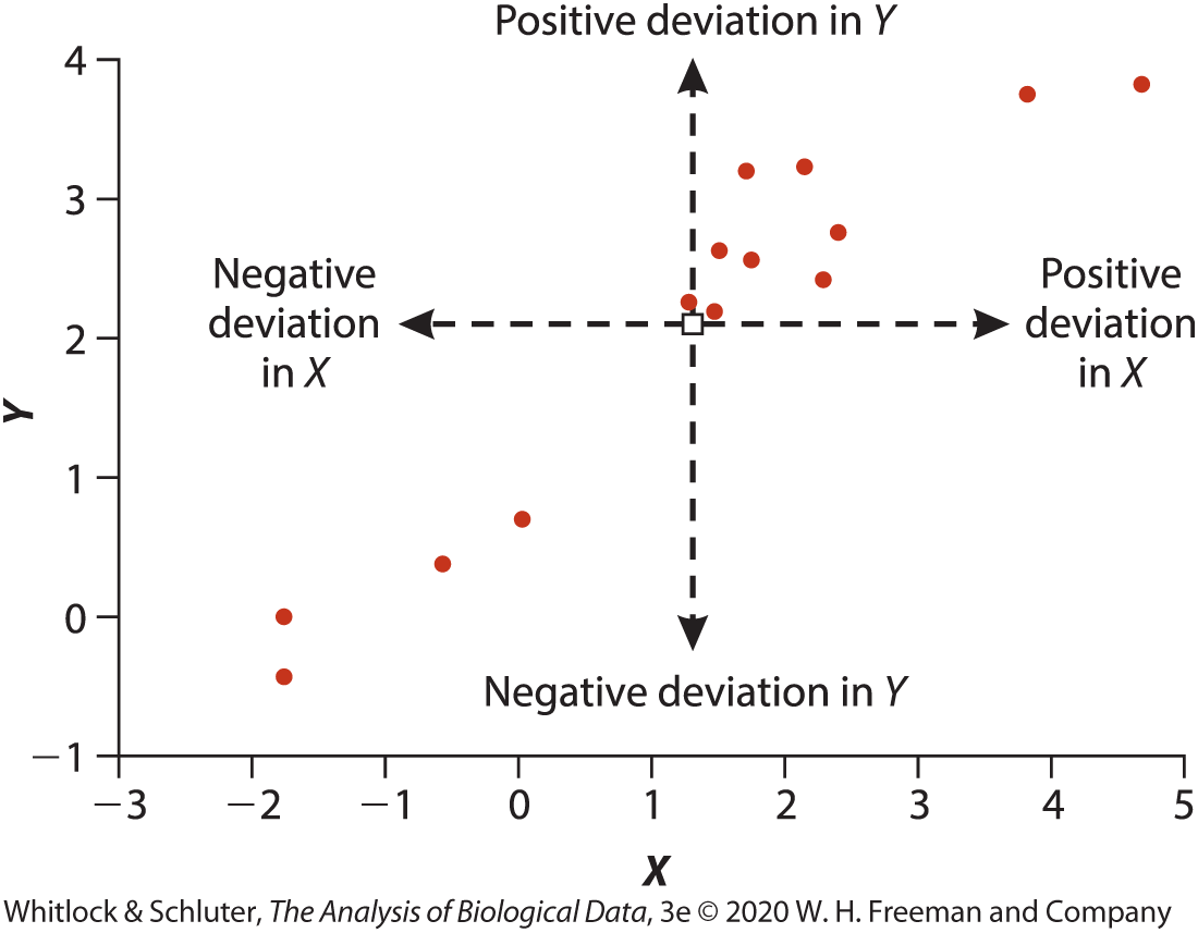
Figure 5: Whitlock & Schluter 3e 2020.

Correlation measures linear relationships

  • Pearson’s correlation describes how closely points follow a straight-line trend
  • A strong linear pattern can produce a large positive or negative \(r\)
  • A curved relationship may have \(r\) near 0 even when X and Y are strongly related
  • Always inspect a scatterplot before interpreting \(r\)
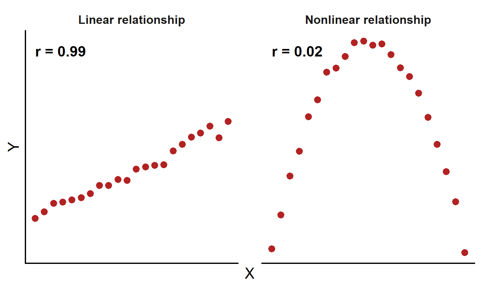
Two-panel scatterplot. Left panel shows points closely following an upward straight-line trend. Right panel shows points following an inverted U-shaped curve. Both panels illustrate relationships between X and Y, but only the left panel is linear.
Figure 6: Pearson correlation measures linear relationships. A strong curved relationship can have a correlation near zero.

Uncertainty in the correlation coefficient

  • Sample correlations vary from sample to sample
  • Larger samples give more precise estimates of correlation
  • Confidence intervals show a range of plausible values for the population correlation \(\rho\)
  • Confidence intervals for correlation require special methods, so software is typically used
  • Report both \(r\) and its confidence interval when possible
library(palmerpenguins)
res <- cor.test(
  formula = ~ bill_length_mm + flipper_length_mm, 
  data = penguins
)
res$estimate
      cor 
0.6561813 
res$conf.int
[1] 0.5912769 0.7126403
attr(,"conf.level")
[1] 0.95

Testing whether the correlation is zero

  • We often test whether the population correlation is zero

    \(H_0:\rho = 0\)

    \(H_A:\rho \ne 0\)

  • A zero correlation means no linear relationship in the population

  • Small p-values provide evidence of a nonzero linear association

  • Statistical significance does not imply a strong or important relationship

res

    Pearson's product-moment correlation

data:  bill_length_mm and flipper_length_mm
t = 16.034, df = 340, p-value < 2.2e-16
alternative hypothesis: true correlation is not equal to 0
95 percent confidence interval:
 0.5912769 0.7126403
sample estimates:
      cor 
0.6561813 

Assumptions of Pearson correlation

  • Observations are an independent random sample from the population
  • The relationship between X and Y is approximately linear
  • The scatter of points forms an elliptical cloud without extreme outliers
  • X and Y are each approximately normally distributed
  • A scatterplot is the best first check of these assumptions
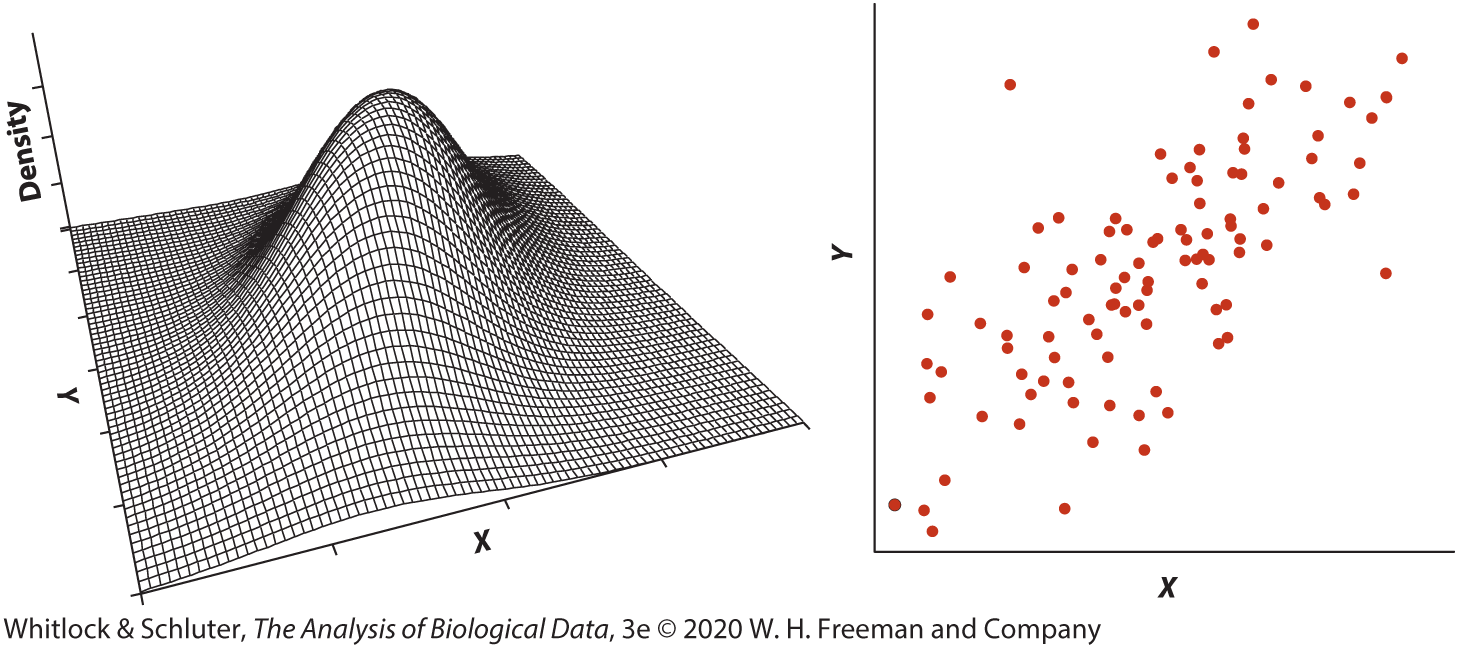
Two-panel figure. Left panel shows a three-dimensional bell-shaped surface representing a bivariate normal distribution. Right panel shows a scatterplot with points forming an upward-sloping elliptical cloud.
Figure 7: A bivariate normal distribution (left) and a sample scatterplot from that distribution (right). When assumptions are met, points form an elliptical cloud with a linear trend. Whitlock & Schluter 3e 2020.

Common departures from assumptions

  • Funnel shape: spread changes across X (heteroscedasticity)
  • Outliers: unusual points can strongly influence r
  • Nonlinear pattern: curved relationships are not described well by Pearson correlation
  • Inspect scatterplots before interpreting or testing correlation
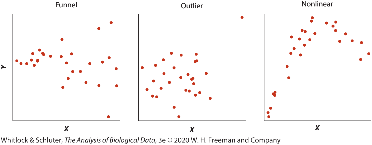
Three-panel figure labeled Funnel, Outlier, and Nonlinear. The first panel widens from left to right, the second contains an extreme point, and the third shows a curved pattern.
Figure 8: Common departures from Pearson correlation assumptions: changing spread, outliers, and nonlinear relationships.

What to do when assumptions are violated

  • Investigate influential outliers rather than automatically deleting them
  • Transform variables (for example log or square-root) to improve linearity or stabilize spread
  • If the relationship is monotonic (consistently increases or consistently decreases) but not linear, use Spearman rank correlation
  • Include a scatterplot when presenting results
cor.test(
  formula = ~ bill_length_mm + flipper_length_mm, 
  data = penguins,
  method = "spearman"
)

    Spearman's rank correlation rho

data:  bill_length_mm and flipper_length_mm
S = 2181594, p-value < 2.2e-16
alternative hypothesis: true rho is not equal to 0
sample estimates:
      rho 
0.6727719 

Correlation depends on the range of values

  • Correlation can become weaker when the range of X values is restricted
  • In the full dataset, body mass and population density show a strong negative correlation
  • Using only species with intermediate body masses reduces the range and lowers \(r\)
  • Correlations from different studies may not be comparable if they use different ranges of data
  • Always consider the range of included observations when interpreting \(r\)
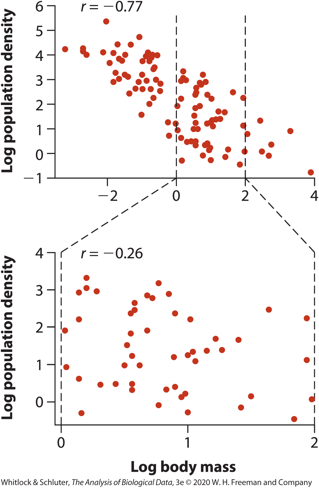
Two-panel figure of scatterplots comparing how correlation changes with range restriction. The top panel shows many species across a wide range of log body mass with a strong negative relationship between body mass and log population density, labeled r equals negative 0.77. Two dashed vertical lines mark a narrower middle range of body mass. The bottom panel replots only points from that restricted range and shows a weaker negative relationship, labeled r equals negative 0.26.
Figure 9: Restricting the range of X values can reduce the magnitude of the correlation coefficient. The full dataset shows a strong negative relationship, while the subset with a narrower range of body mass shows a weaker correlation.

Measurement error weakens correlation

  • Measurement error adds random noise to X, Y, or both variables
  • Random measurement error usually makes the observed correlation closer to 0
  • This bias toward zero is called attenuation
  • Better measurement methods and repeated measurements can reduce this problem
  • Weak observed correlations may partly reflect poor measurement quality
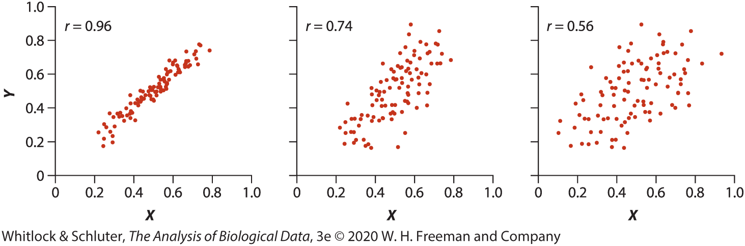
Three-panel figure of scatterplots showing the effect of measurement error on correlation. All panels show positive relationships between X and Y. The left panel has tightly clustered points and is labeled r equals 0.96. The middle panel has more scatter and is labeled r equals 0.74. The right panel has the most scatter and is labeled r equals 0.56.
Figure 10: Measurement error can weaken the observed correlation between two variables. The left panel shows a very strong positive relationship with little measurement error. The middle panel adds error to one variable, reducing the correlation. The right panel adds error to both variables, further weakening the observed correlation.

Correlation matrices

  • When a dataset has many numerical variables, we can calculate all pairwise correlations at once
  • A correlation matrix summarizes the correlation between every pair of variables
  • corrplot() displays the matrix using colors, circles, or numbers
  • Larger and darker symbols indicate stronger correlations
  • Useful for exploring patterns before building models
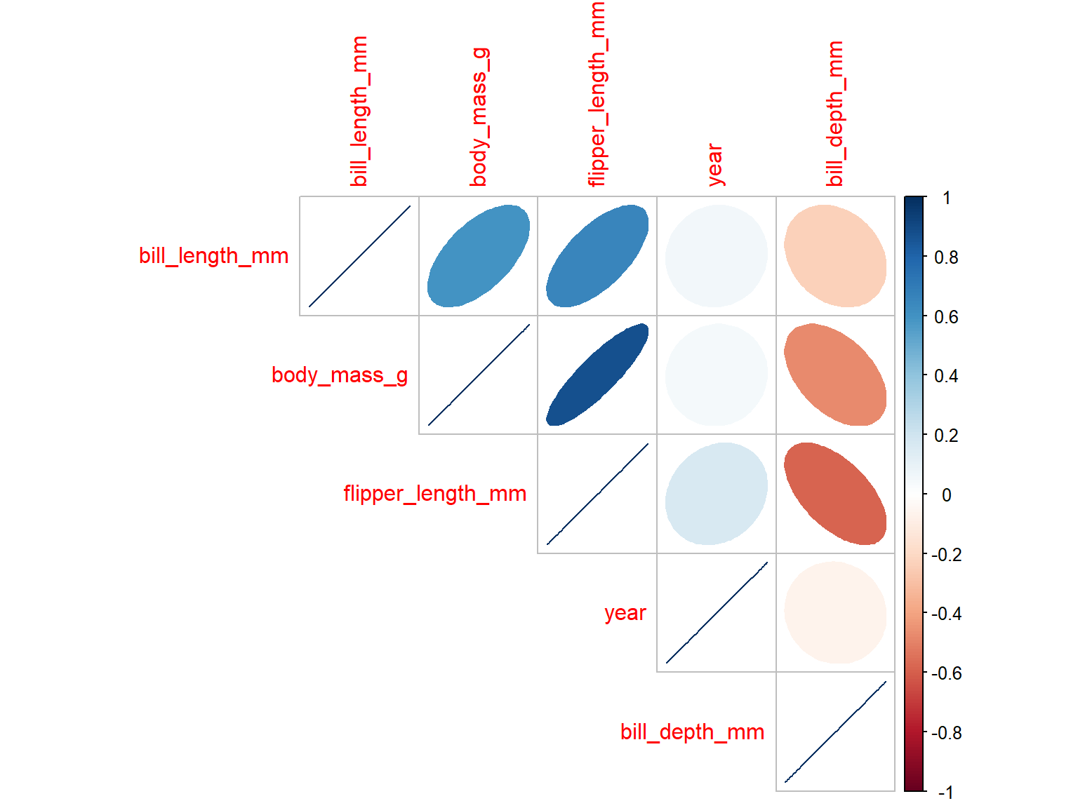
Correlation matrix plot showing pairwise correlations among numerical variables in the penguins dataset. Colored circles vary in size and color according to the strength and direction of correlation.
Figure 11: Correlation matrix of numerical variables in the penguins dataset.

Summary

  • Correlation describes the strength and direction of association between two numerical variables
  • Pearson’s correlation coefficient ranges from \(-1\) to \(+1\)
  • Correlation does not imply causation
  • Pearson correlation is most appropriate for approximately linear relationships without major outliers
  • Always inspect scatterplots for nonlinearity, outliers, and unequal spread
  • Spearman rank correlation for non-linear (monotonic) relationships
  • Restricted range and measurement error can weaken observed correlations