Lecture 21
Regression
Regression
ABD 3e Chapter 17
Regression example
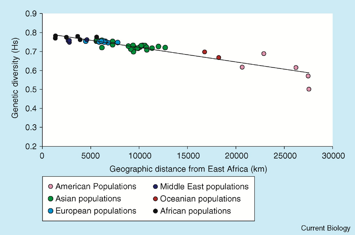
Genetic diversity in human populations is related to distance from East Africa.
A fitted line can be used to predict expected genetic diversity from migration distance.
The downward slope suggests diversity decreases as distance increases.
Two variables in regression
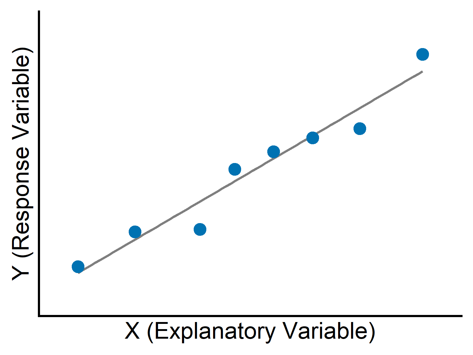
Response variable (\(Y\)): the outcome we want to predict.
Explanatory variable (\(X\)): the variable used to explain or predict \(Y\).
In scatter plots for regression:
- \(X\) is placed on the horizontal axis.
- \(Y\) is placed on the vertical axis.
Linear regression
The most common type of regression is linear regression.
It fits a straight line through data to predict \(Y\) from \(X\).
A key assumption is that the true relationship is approximately linear.
If the relationship is strongly curved, a straight line may be inappropriate.
Example 17.1: The lion’s nose
Managers want to estimate the ages of male lions.
Older males may be removed with less disruption than younger males.
Black pigmentation on the nose increases with age.
We use proportion black on the nose to predict age.

Lion data
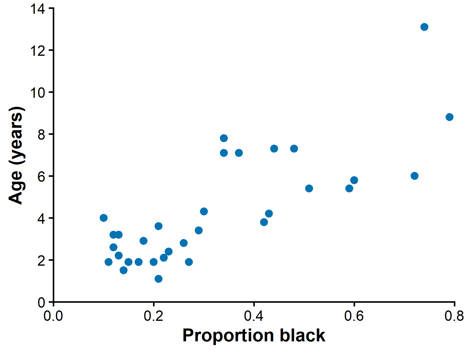
Data from 32 male lions of known age.
\(X\) = proportion black on the nose.
\(Y\) = age (years).
A scatter plot is the first step.
Comparing possible lines
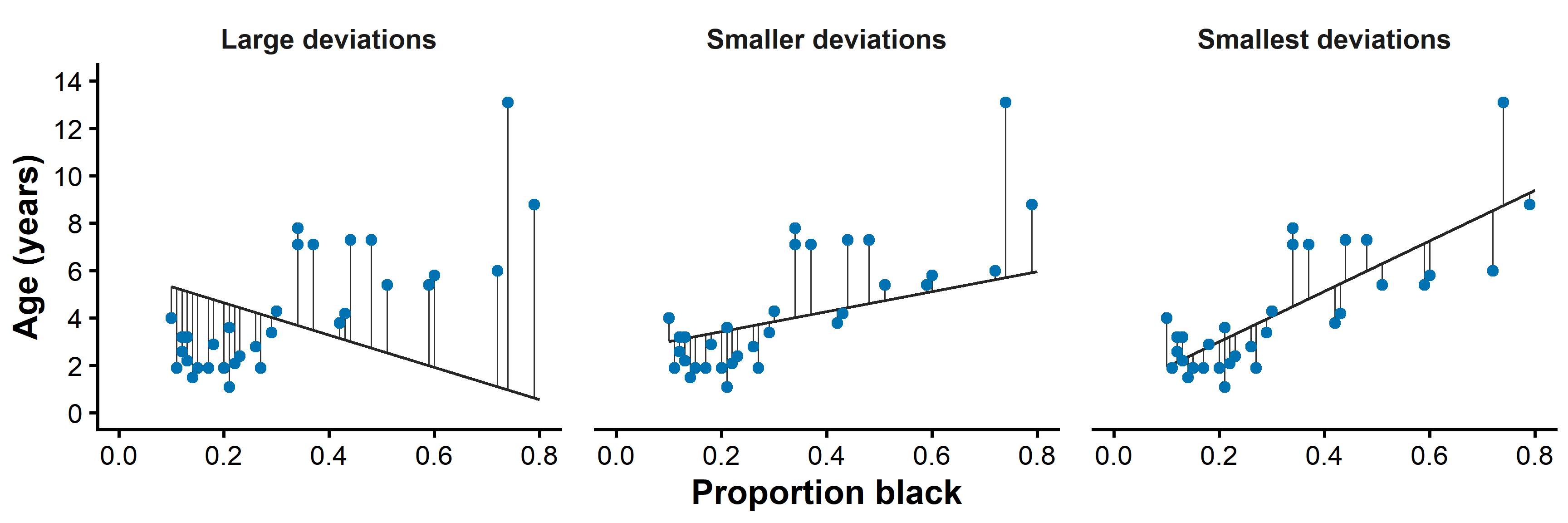
Poorly chosen lines have large deviations from the data.
Better lines have smaller deviations.
The least squares line minimizes the sum of squared deviations.
The intercept and slope
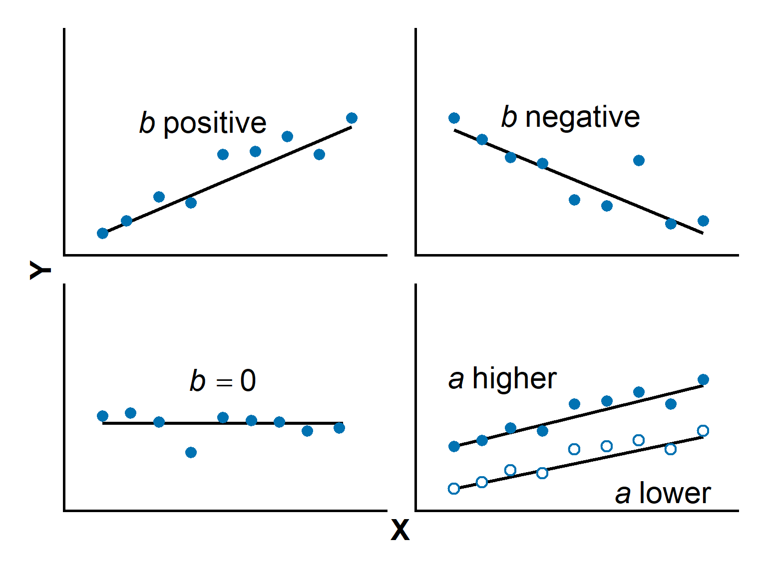
Intercept : the predicted value of \(Y\) when \(X = 0\)
- Where the line crosses the \(y\)-axis
- Units are same as response variable
Slope : the change in \(Y\) for a one-unit increase in \(X\).
- Positive slope: larger \(X\) predicts larger \(Y\).
- Negative slope: larger \(X\) predicts smaller \(Y\).
- Zero slope: no linear trend.
- The rate of change in \(Y\) per unit of \(X\).
Lion regression equation
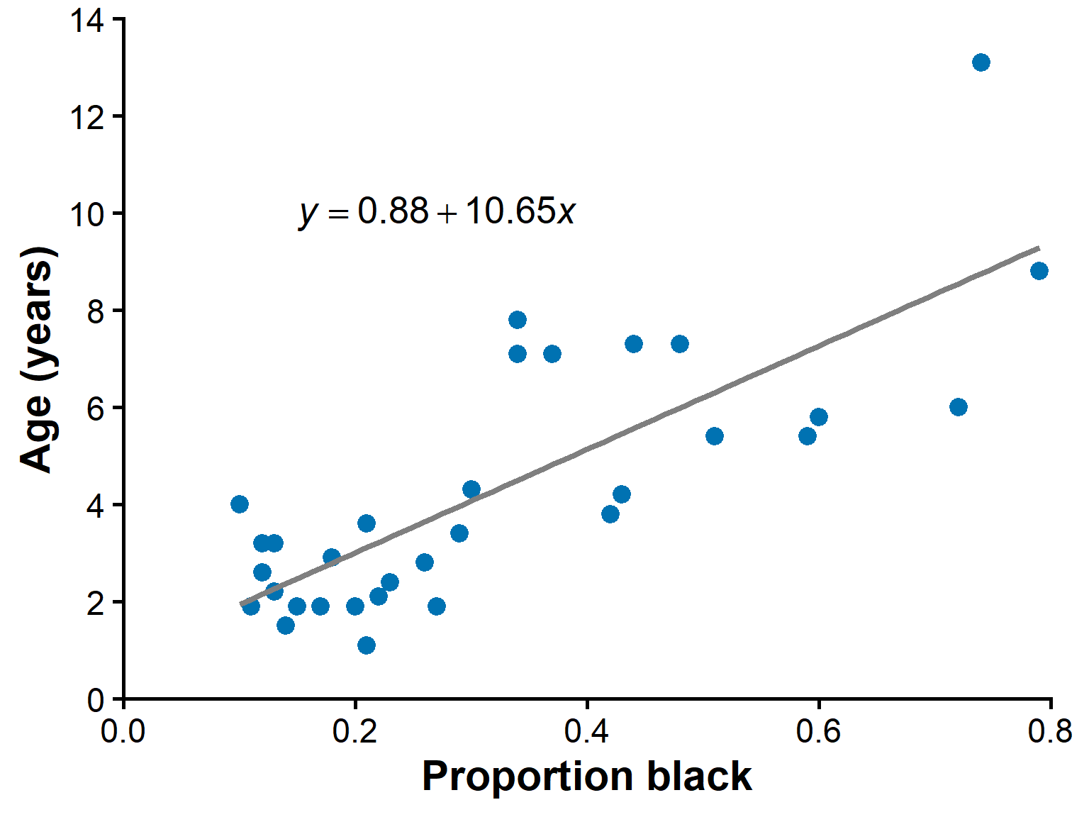
- For the lion data, the fitted line is approximately:
\[ \hat{Y} = 0.88 + 10.65X \]
- Equivalent interpretation:
\[ \widehat{\text{Age}} = 0.88 + 10.65(\text{proportion black}) \]
Interpreting the lion slope
Each 1.0 increase in proportion black predicts about 10.65 more years of age.
More practically, a 0.10 increase predicts about:
\[ 10.65 \times 0.10 = 1.065 \]
years older on average.
Lion fitted line
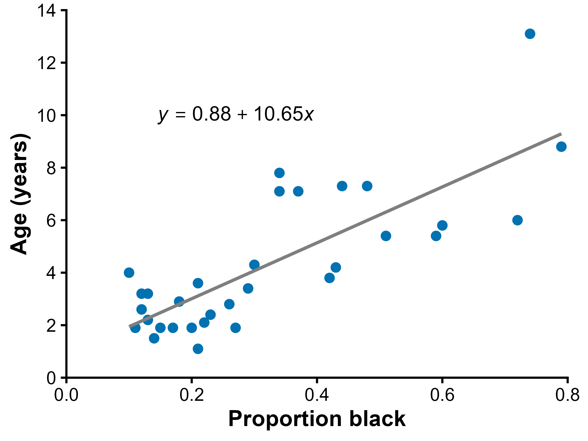
The line summarizes the average trend.
Individual lions vary around the line.
Not every point falls exactly on the prediction line.
Use caution with prediction
Predictions most reliable within the observed range of \(X\) values
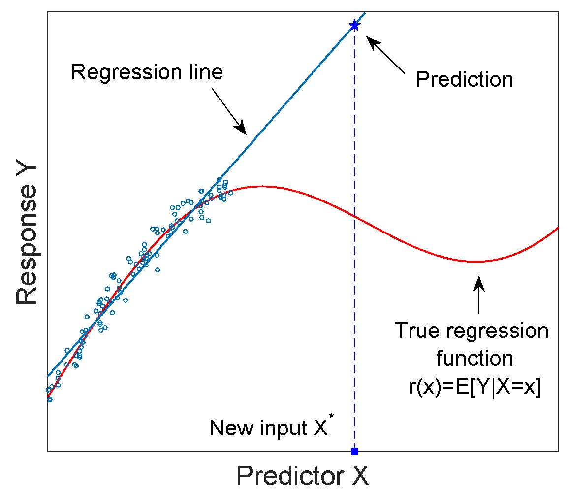
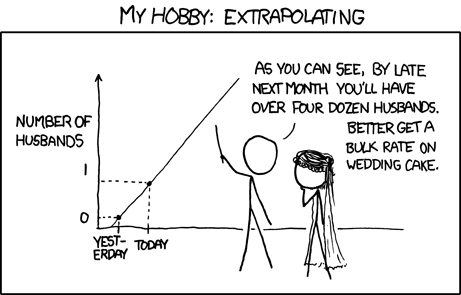
Predicting far outside the data range is called extrapolation
May misleading because relationship may change beyond sampled data
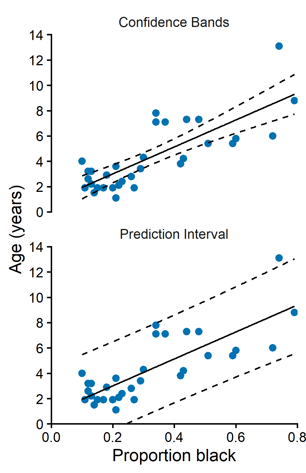
Confidence bands vs prediction intervals
Confidence band : interval for the mean response
- narrower
- uncertainty in the fitted line
- Used when studying the overall trend.
Prediction interval : interval for a single observation
- wider
- includes uncertainty in the line plus individual variation
- Used when predicting one case.
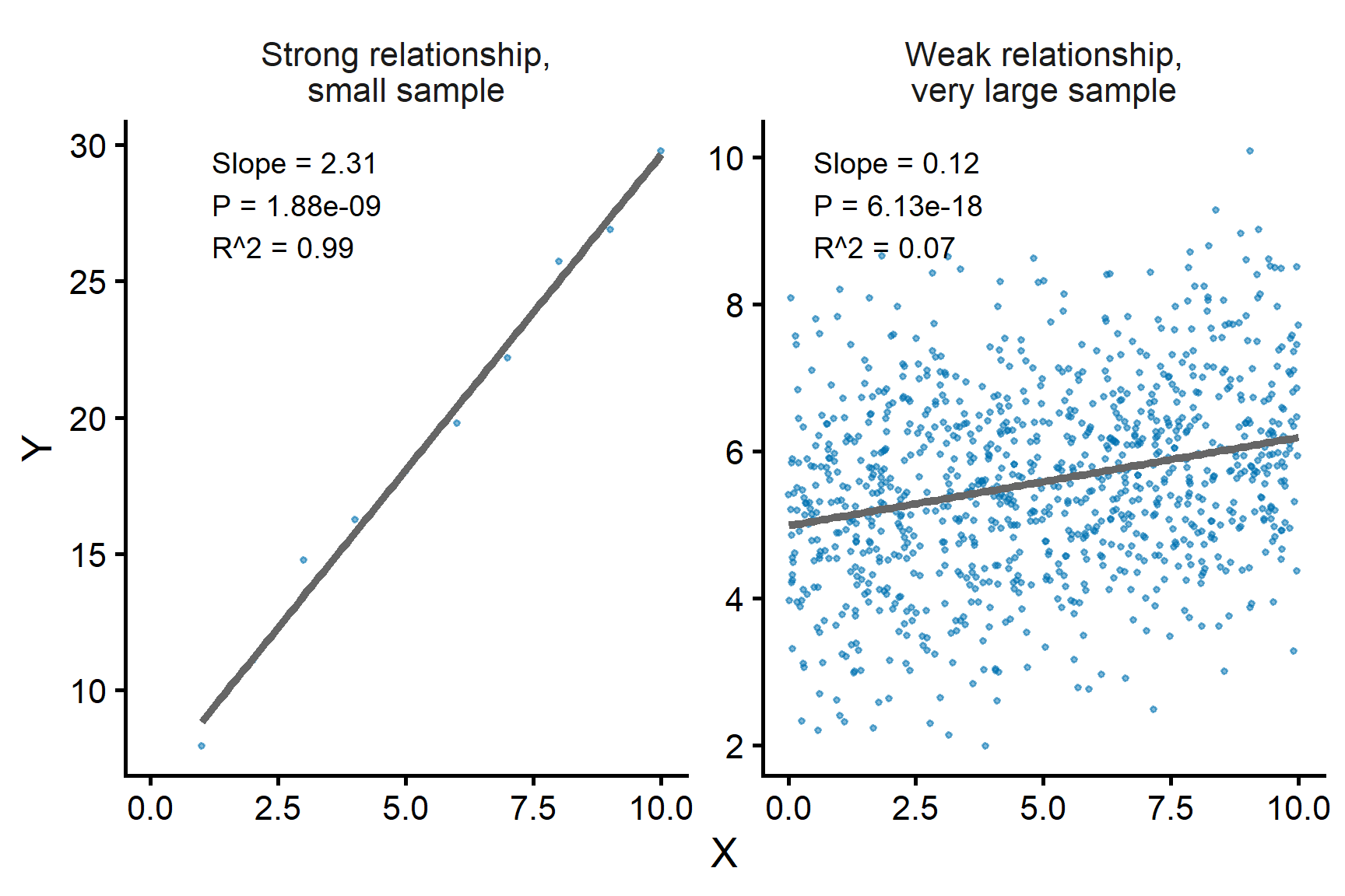
Interpreting the slope test
A significant result (\(p<\alpha\)) suggests evidence that \(X\) is linearly associated with \(Y\) and may help predict \(Y\).
It does not establish causation.
Statistical significance does not necessarily mean a strong relationship or a large slope.
A small slope can be statistically significant if the sample size is large.
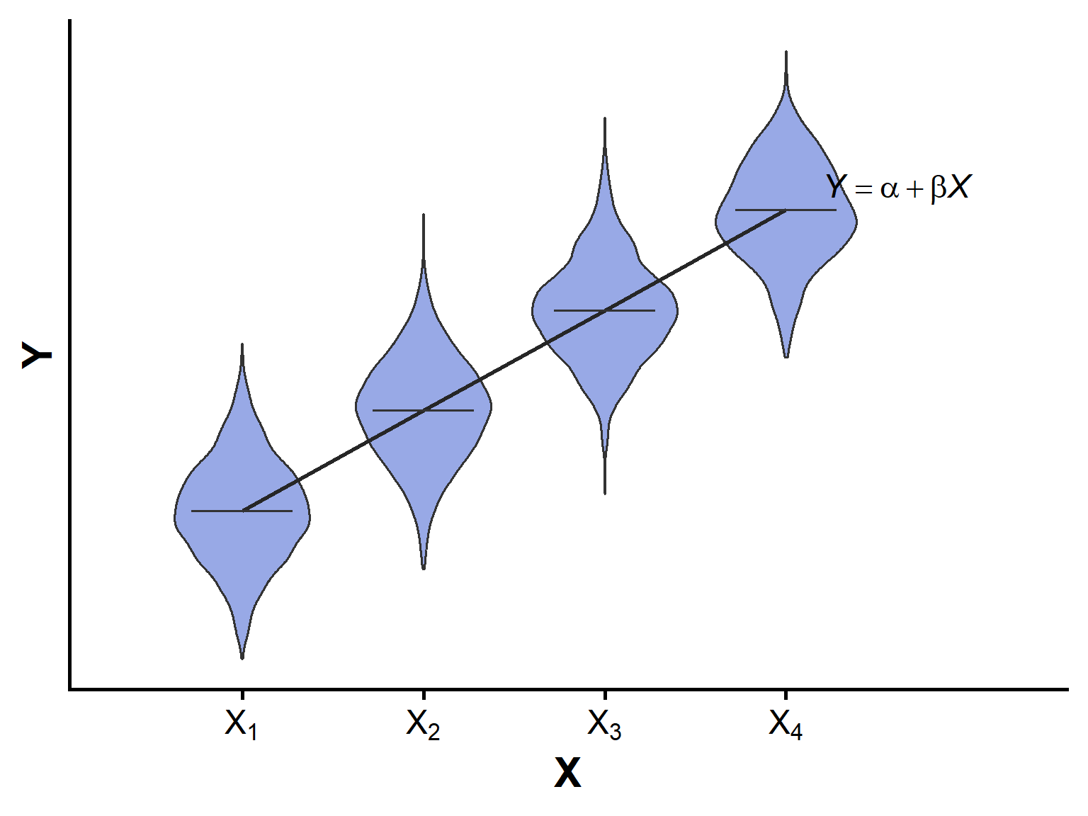
Assumptions of linear regression
- Relationship between \(X\) and mean \(Y\) is approximately linear
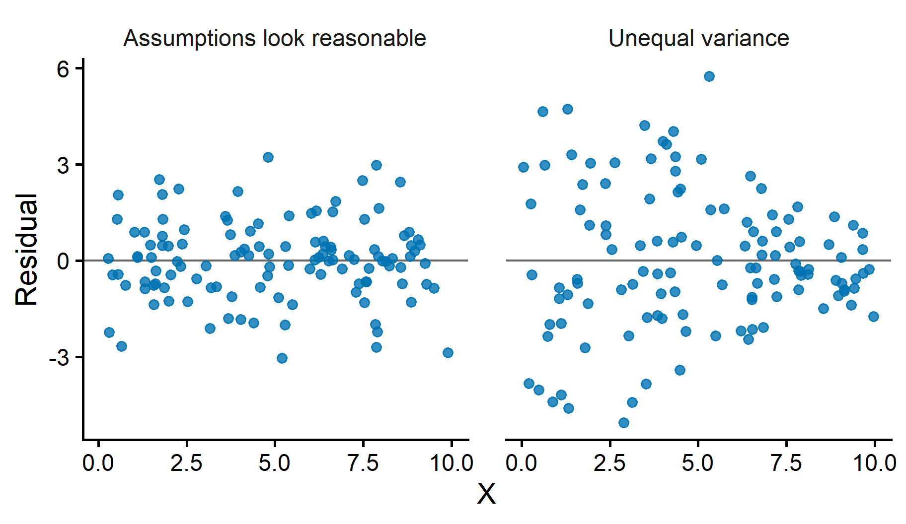
- Residuals have similar spread across values of \(X\)
- Observations are independent
- Residuals are approximately normal (mainly important for tests and intervals)
- Use graphs to evaluate assumptions
Residual plots help assess regression model assumptions
- A residual is the difference between the observed value and the predicted value:
\[ e_i = y_i - \hat{y}_i \]
Positive residuals: points above the regression line
Negative residuals: points below the line
Plot residuals against \(X\) or against fitted values (\(\hat{y}\))
Help assess linearity, constant variance, and unusual observations
Detecting nonlinearity
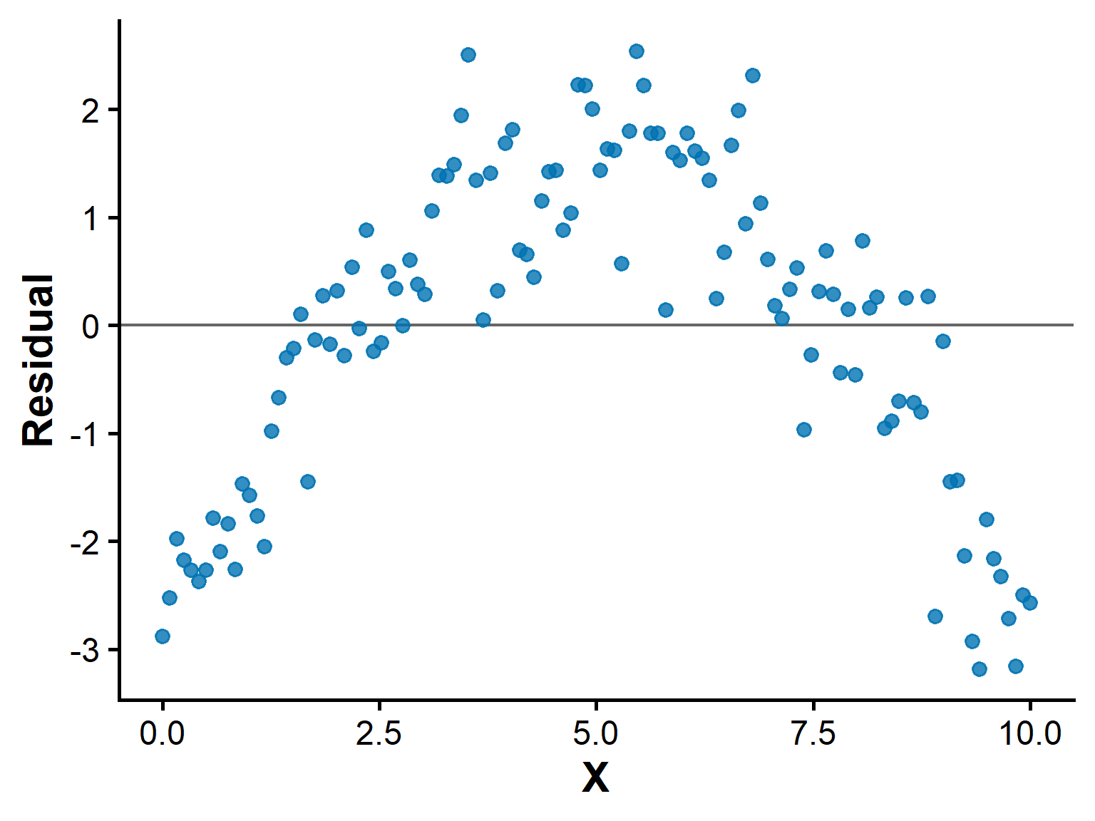
If the scatterplot bends or levels off, a straight-line model may be inappropriate.
Residual plots can reveal curved patterns more clearly.
A curved residual pattern suggests the line is not fitting well.
Random scatter around zero is more consistent with a good linear fit.
Do not force a straight line onto clearly curved data.