
Lecture 22
Analyzing Multiple Factors

ABD 3e Chapter 18

Chris Merkord

Learning Objectives

  • Explain how linear models extend regression to analyze multiple explanatory variables
  • Distinguish between numerical and categorical predictors and interpret common model terms such as main effects, interactions, blocks, and covariates
  • Explain how factorial designs, blocking, and ANCOVA are represented in linear models
  • Interpret F-tests used to evaluate whether adding a term improves model fit
  • Evaluate model assumptions using residual plots and other graphical displays
  • Explain why interaction terms and design-related variables should be removed cautiously

Linear Models

Why studies often include multiple factors

  • Many studies measure more than one explanatory variable

  • Real biological systems are influenced by multiple causes

  • Can test several questions using one dataset

  • Can reduce bias by accounting for other variables

  • Examples:

    • fertilizer and sunlight on plant growth
    • habitat and sex on body mass
    • treatment while adjusting for age
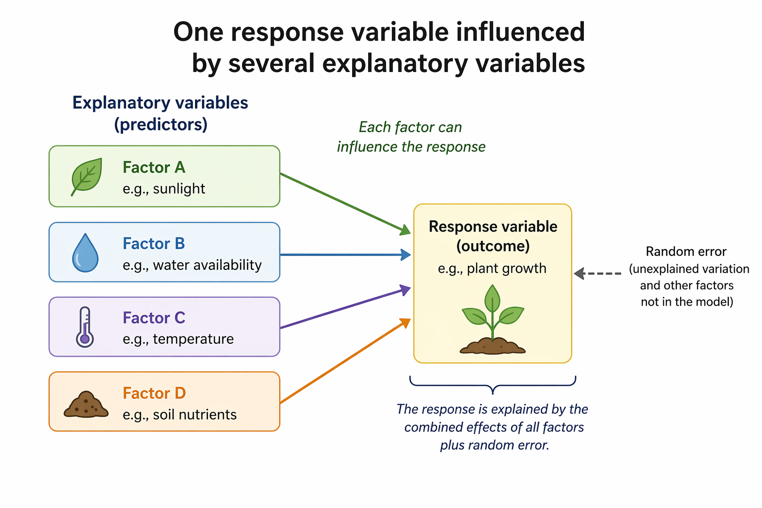
Diagram with four explanatory variables on the left (sunlight, water availability, temperature, and soil nutrients) shown as separate boxes with arrows pointing to one response variable on the right labeled plant growth. A dashed arrow labeled random error also points to the response, indicating unexplained variation outside the model.
Figure 1: Conceptual diagram showing how multiple explanatory variables can jointly influence a single response variable, while additional unexplained variation is captured as random error.

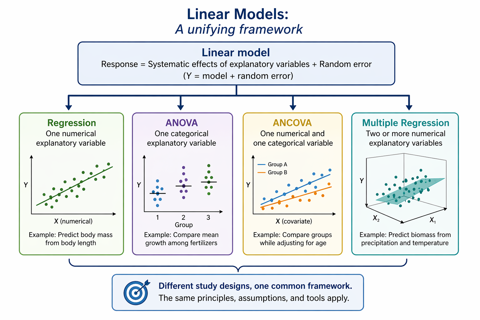
Linear models provide one common framework

  • Many methods are versions of the same idea
  • A linear model relates a numerical response to one or more explanatory variables
  • General form:

\[ \text{Response} = \text{systematic effects} +\\ \text{random error} \]

  • Includes:
    • regression
    • ANOVA
    • ANCOVA
    • multiple regression
Flowchart with a central box labeled Linear Models connected to four branches: Regression, ANOVA, ANCOVA, and Multiple Regression. Each branch includes a small example graph and notes the type of explanatory variables used: one numerical predictor for regression, one categorical predictor for ANOVA, one numerical plus one categorical predictor for ANCOVA, and two or more numerical predictors for multiple regression.
Figure 2: Diagram showing how regression, ANOVA, ANCOVA, and multiple regression can all be viewed as special cases within the broader framework of linear models.

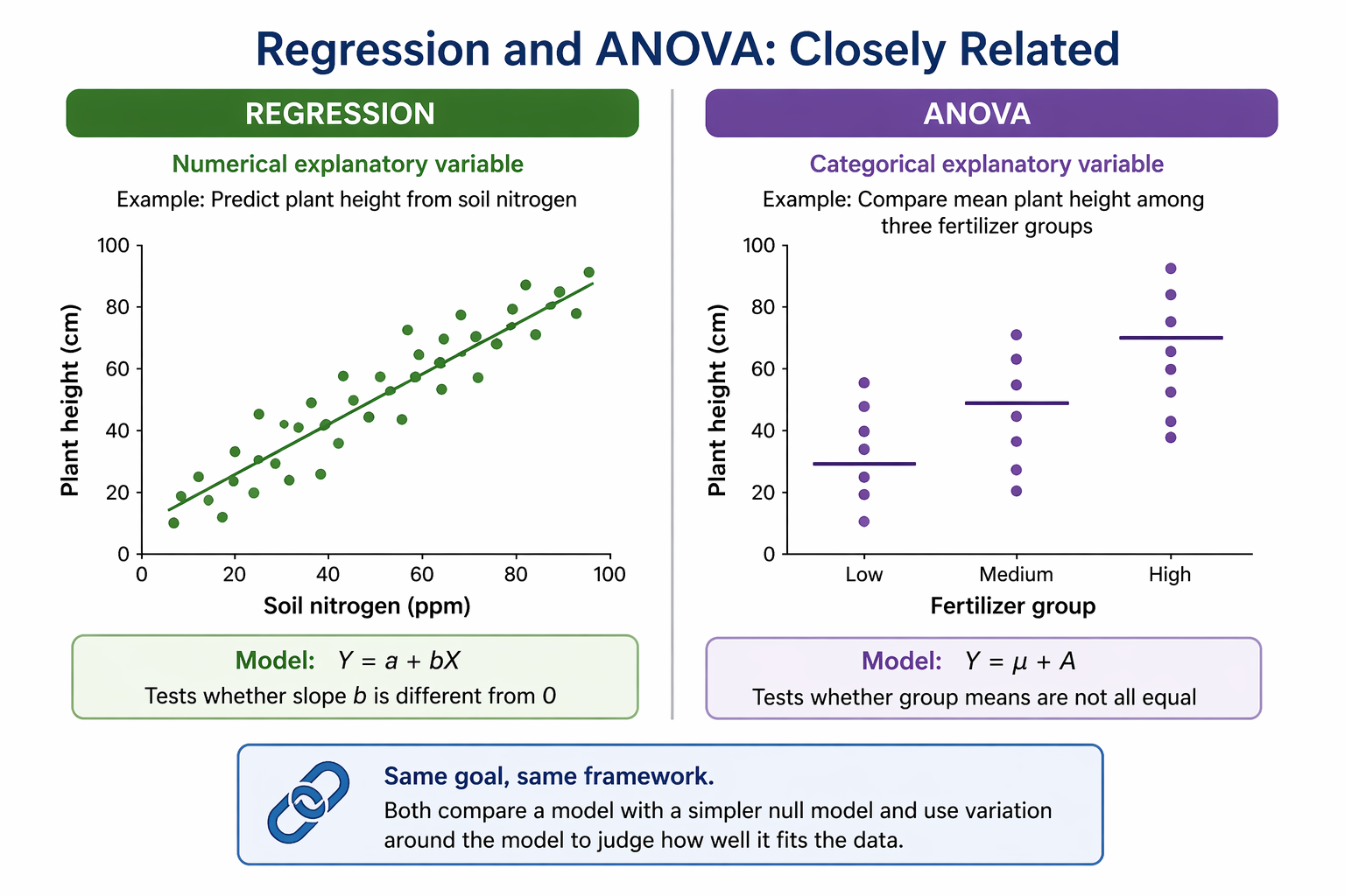
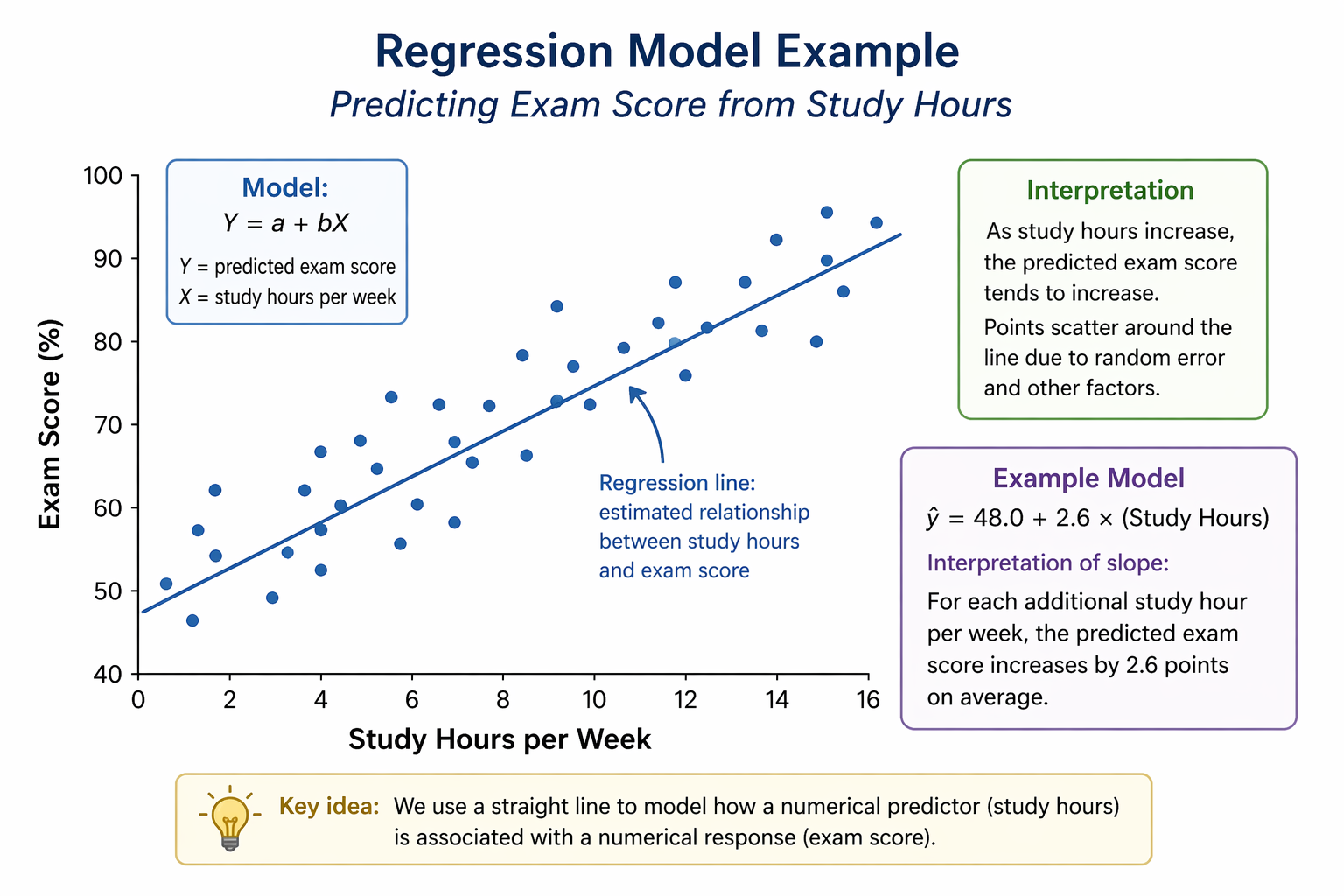
Regression model example

  • Predict exam score from study hours

\[ Y = a + bX \]

  • \(a\) = intercept

  • \(b\) = slope

  • \(X\) = explanatory variable

  • \(Y\) = predicted response

Scatterplot with study hours per week on the horizontal axis and exam score percent on the vertical axis. Individual points show students with varying scores, and an upward sloping regression line runs through the cloud of points, indicating that students who study more hours generally earn higher exam scores.
Figure 4: Scatterplot illustrating a simple linear regression model in which exam scores tend to increase as weekly study hours increase, with a fitted line summarizing the average relationship.

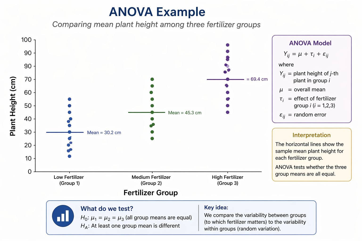
ANOVA model example

  • Compare mean growth among fertilizer groups

\[ Y = \mu + A \]

  • \(\mu\) = grand mean

  • \(A\) = group effect

  • Tests whether group means differ

Dotplot with fertilizer group on the horizontal axis (Low, Medium, High) and plant height in centimeters on the vertical axis. Each group contains multiple plant height observations shown as dots. Horizontal lines across each group indicate the sample mean, with higher average height in the High fertilizer group than in the Medium and Low groups.
Figure 5: Dotplot illustrating a one-way ANOVA comparing plant heights among three fertilizer groups, with horizontal lines marking each group mean.

Model statements in words

  • We often describe models using variable names

  • Example:

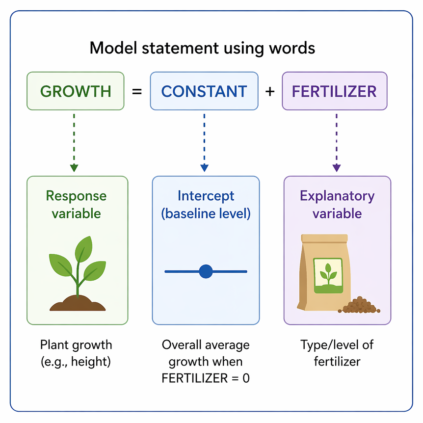
\[ GROWTH = CONSTANT + \\ FERTILIZER \]

  • Easier to read than symbols
  • Highlights study design
  • Common in software formulas and output
Diagram titled Model statement using words showing GROWTH = CONSTANT + FERTILIZER across the top. Arrows point downward from each term to labeled boxes explaining their roles: GROWTH as the response variable with a plant icon, CONSTANT as the intercept or baseline level, and FERTILIZER as the explanatory variable with a fertilizer bag icon. Additional text notes plant growth as an example response and fertilizer type or level as the predictor.
Figure 6: Example of a model statement written with variable names instead of symbols.

Multiple-factor model statements

Two predictors:

\[ RESPONSE = CONSTANT \\ + A + B \]

With interaction:

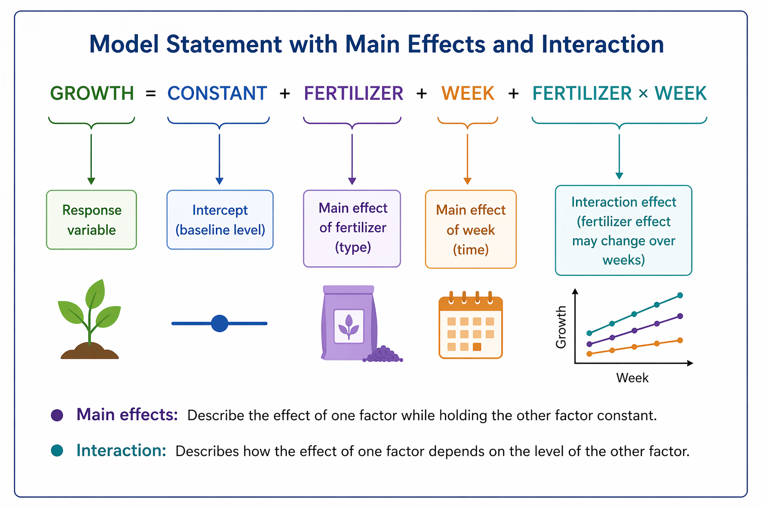
\[ RESPONSE = CONSTANT \\ + A + B + A \times B \]

\(A \times B\) means the effect of one variable depends on the other

Diagram centered on the model statement GROWTH = CONSTANT + FERTILIZER + WEEK + FERTILIZER × WEEK. Colored labels identify each component: response variable, intercept, main effect of fertilizer, main effect of week, and interaction effect. Icons and arrows connect terms to explanations, and a small graph shows different growth lines over time to illustrate that the fertilizer effect changes across weeks.
Figure 7: Annotated example of a linear model showing response, main effects, and an interaction term.

Common analyses are all linear models

Linear Model Other name Example study design
\(Y = \mu + X\) Linear regression Dose-response
\(Y = \mu + A\) One-way (single-factor) ANOVA Completely randomized
\(Y = \mu + A + b\) Two-way, fixed-effect ANOVA Randomized block
\(Y = \mu + A + B + A*B\) Two-way fixed-effects ANOVA Factorial experiment
\(Y = \mu + A + b + A*b\) Two-way mixed-effects ANOVA Factorial experiment
\(Y = \mu + X + A\) ANCOVA Observational study
\(Y = \mu + X_1 + X_2 + X_1*X_2\) Multiple regression Dose-response

\(\mu\) is a constant, \(Y\) is the numerical response variable, \(X\) is a numerical explanatory variable, \(A\) and \(B\) are fixed, categorical variables; \(b\) is a blocking or other random-effect categorical variable

Comparing Models

Comparing models with the F-test

  • Many questions ask whether adding a variable improves the model

  • We compare:

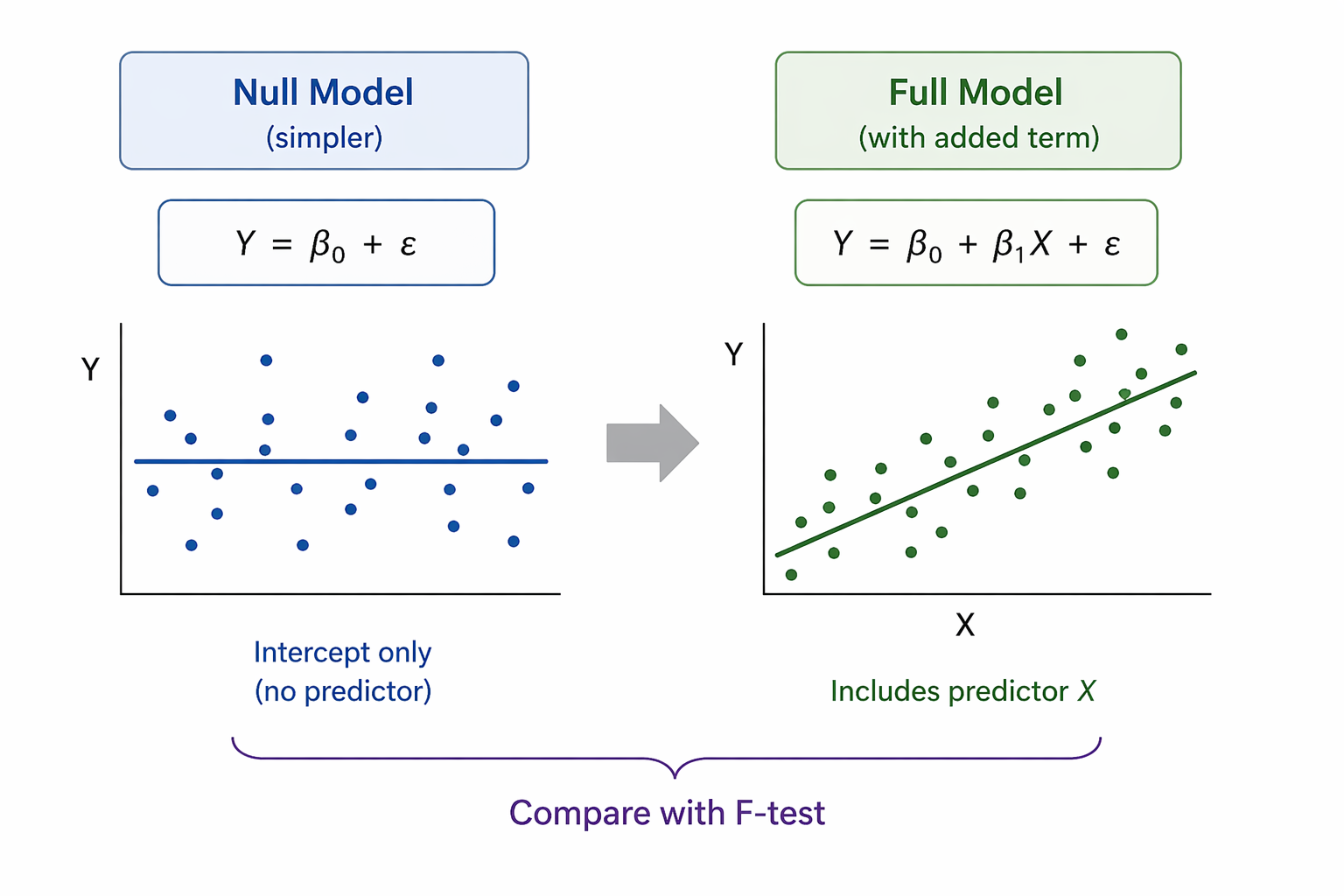
    • Null model
      simpler model without the term

    • Full model
      includes the term of interest

  • If fit improves enough, the term may matter

Two-panel diagram comparing statistical models. Left panel shows a null model with scattered points around a horizontal mean line, representing an intercept-only model with no predictor. Right panel shows a full model with points following an upward trend and a fitted regression line, representing a model that includes an explanatory variable. An arrow between panels indicates comparing the two models.
Figure 8: Comparison of a null model and a fuller model. Here, \(\beta_0\) is the intercept, \(\beta_1\) is the effect of predictor \(X\), and \(\varepsilon\) represents random error.

Example: does fertilizer improve prediction?

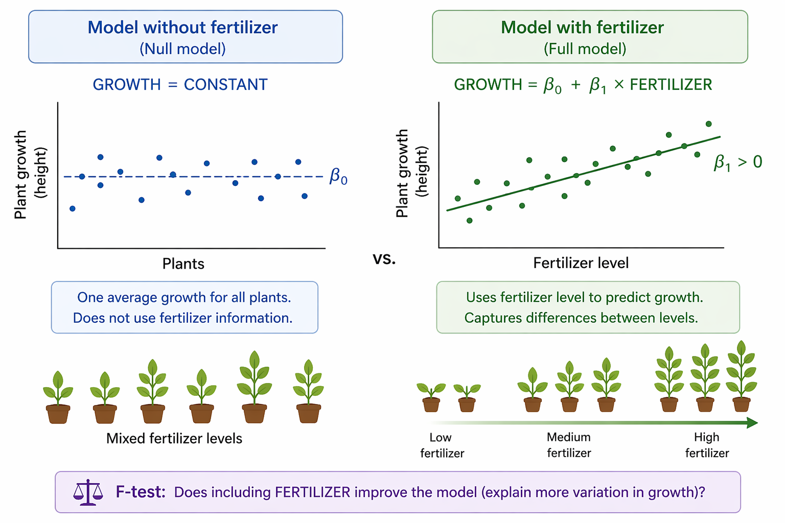
  • Null model:

\[ GROWTH = CONSTANT \]

  • Full model:

\[ GROWTH = CONSTANT + FERTILIZER \]

  • Ask whether fertilizer explains additional variation in growth
Two-panel diagram comparing models of plant growth. Left panel shows a null model with plant growth observations scattered around a single horizontal mean line, representing one average growth value for all plants regardless of fertilizer. Right panel shows a full model with an upward trend line relating fertilizer level to plant growth, indicating that higher fertilizer levels are associated with greater growth. Small plant icons below illustrate increasing plant size from low to high fertilizer.
Figure 9: Comparison of plant growth modeled with and without fertilizer as a predictor. The null model uses one overall mean, whereas the fuller model uses fertilizer level to explain differences in growth.

The F-statistic asks whether the fuller model fits better

  • Compare a simpler null model to a fuller model

  • Ask whether adding the new term improves fit enough to matter

  • Large F values suggest stronger evidence for improvement

  • Small F values suggest little improvement

Two-panel diagram comparing models of plant growth. Left panel shows a null model with plant growth observations scattered around a single horizontal mean line, representing one average growth value for all plants regardless of fertilizer. Right panel shows a full model with an upward trend line relating fertilizer level to plant growth, indicating that higher fertilizer levels are associated with greater growth. Small plant icons below illustrate increasing plant size from low to high fertilizer.
Figure 10: Comparison of plant growth modeled with and without fertilizer as a predictor. The null model uses one overall mean, whereas the fuller model uses fertilizer level to explain differences in growth.

Interpreting the p-value

  • The p-value asks:

  • If the added term truly had no effect, how unusual is this F value?

  • Small p-value:

    • evidence the added term improves the model
  • Large p-value:

    • data are consistent with no meaningful improvement
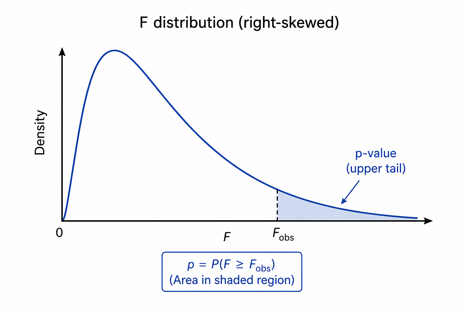
Graph of an F distribution with density on the vertical axis and F values on the horizontal axis. The curve rises quickly near zero and gradually tapers to the right, showing a right-skewed shape. A vertical dashed line marks the observed F-statistic, and the area under the curve to the right of that line is shaded to indicate the p-value.
Figure 11: Right-skewed F distribution with the shaded upper-tail area representing the p-value for an observed F-statistic.

Analyzing experiments with blocking

Blocking reduces background variation

  • Sometimes experimental units differ before treatment begins

  • Those pre-existing differences can add noise

  • Blocking groups similar units together

  • Treatments are then compared within each block

  • Goal: improve ability to detect treatment effects

Randomized block design

  • A randomized block design is like a paired design with more than two treatments

  • Each block receives every treatment once

  • Example:

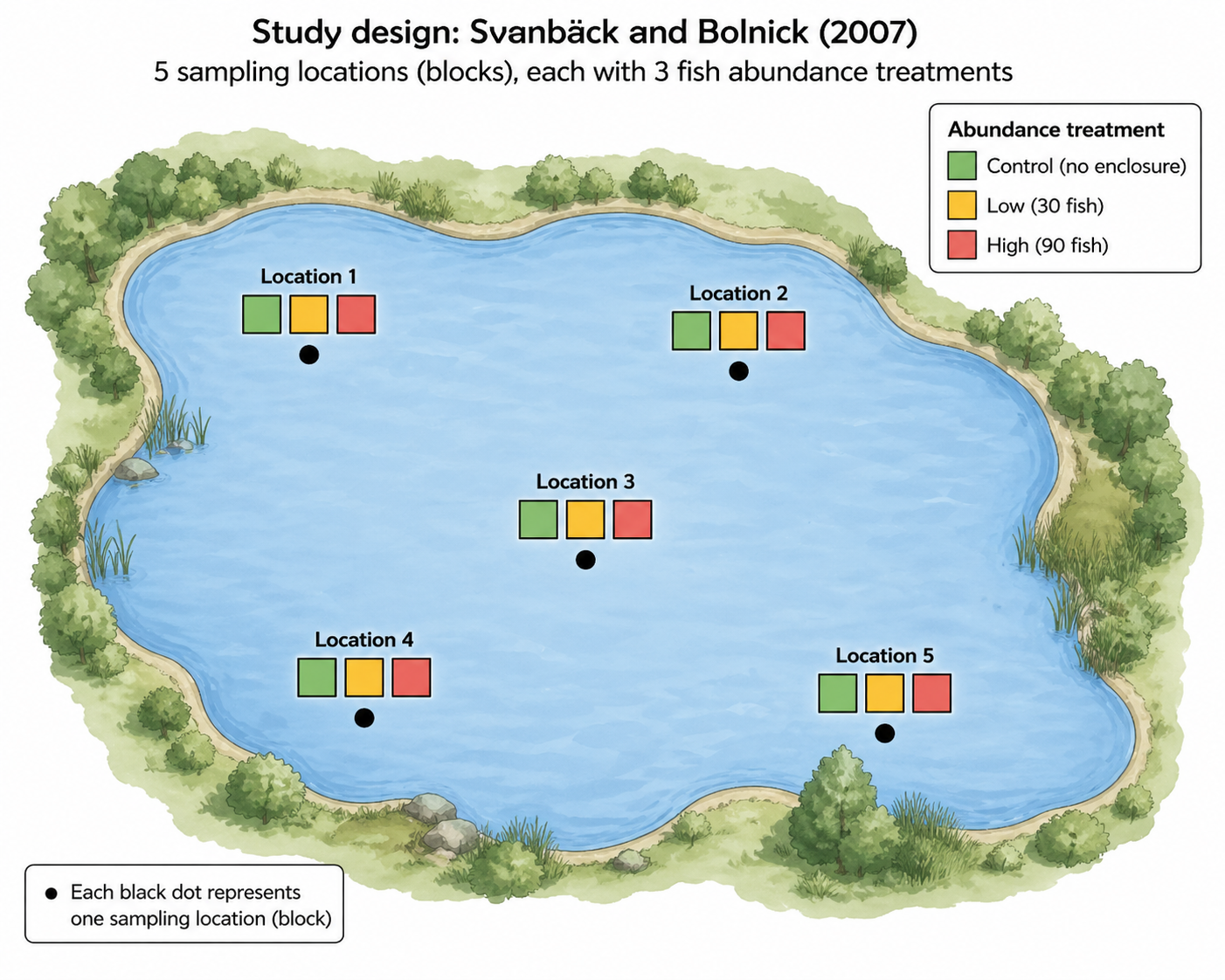
    • 5 lake locations = blocks

    • 3 fish abundance treatments per location

  • Compare treatments within location, not across mixed locations

Zooplankton diversity experiment

  • Researchers tested whether fish abundance affects zooplankton diversity

  • Treatments:

    • Control

    • Low fish abundance

    • High fish abundance

  • Five lake locations were used as blocks

  • Response variable: diversity index (Levin’s \(D\))

Top-down diagram of an irregularly shaped lake with five labeled sampling locations distributed around the lake. Each location contains three small colored squares representing fish abundance treatments: Control, Low, and High. A legend identifies the treatment colors. The figure illustrates a randomized block design in which every block receives all three treatments.
Figure 12: Diagram of the randomized block design used by Svanbäck and Bolnick (2007), showing five lake locations (blocks), each containing Control, Low, and High fish abundance treatments.

Results of zooplankton diversity experiment

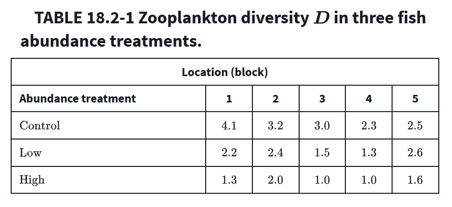
Table 1: Zooplankton diversity D in three fish abundance treatments. Data from Svanbäck and Bolnick (2007), reproduced in Whitlock & Schluter (2020).

Why not use one-way ANOVA only?

  • Measurements from the same location are not independent

  • Conditions may differ among lake locations

  • Ignoring location mixes treatment effects with site differences

  • Include BLOCK in the model instead

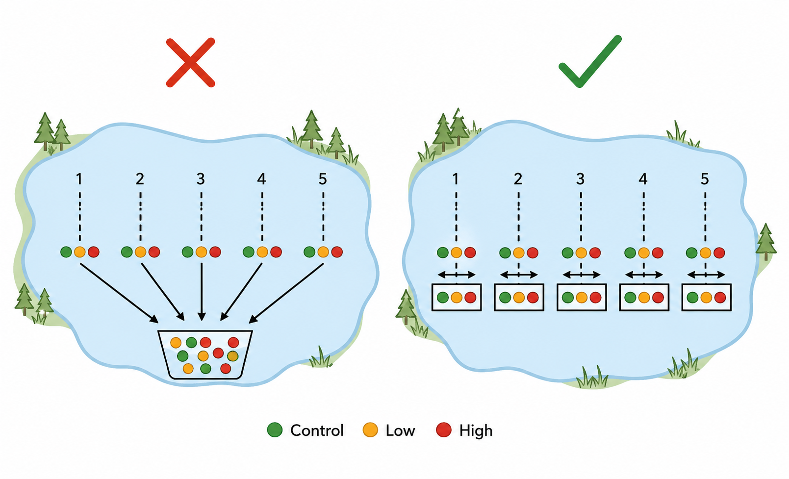
Two-panel diagram comparing analyses of a blocked experiment. Left panel shows five lake locations with treatment observations pooled into one mixed group, marked with a red X to indicate ignoring location. Right panel shows the same five locations with treatments compared separately within each location, marked with a green check to indicate blocking. Colored circles represent Control, Low, and High treatments.
Figure 13: Ignoring location mixes site differences with treatment comparisons, whereas blocking compares treatments within each location.

Model statements with and without blocking

  • Tests whether adding ABUNDANCE improves fit
  • If treatment matters, the full model fits better

Null model

  • Separate averages for each block

\[ \begin{aligned} \text{DIVERSITY} &= \text{CONSTANT} \\ &\quad + \text{BLOCK} \end{aligned} \]

Full model

  • Keeps blocks and adds treatment effects

\[ \begin{aligned} \text{DIVERSITY} &= \text{CONSTANT} \\ &\quad + \text{BLOCK} \\ &\quad + \text{ABUNDANCE} \end{aligned} \]

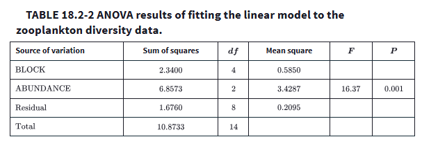
Results from the \(F\)-test

  • Adding ABUNDANCE significantly improved model fit

  • Reported result:

    • \(F = 16.37\)

      • compares 2 nested models

      • higher values = added term explains meaningful variation

    • \(P = 0.001\)

  • Evidence that fish abundance affected zooplankton diversity

ANOVA table with rows for BLOCK, ABUNDANCE, Residual, and Total. Columns include sum of squares, degrees of freedom, mean square, F statistic, and P value. The ABUNDANCE row shows F = 16.37 and P = 0.001, indicating that fish abundance treatment significantly improved model fit after accounting for block differences among locations.
Table 2: ANOVA results for the blocked linear model testing whether fish abundance treatment affected zooplankton diversity after accounting for lake location. Data from Svanbäck and Bolnick (2007), as presented by Whitlock & Schluter (2020).

Interpreting the effect

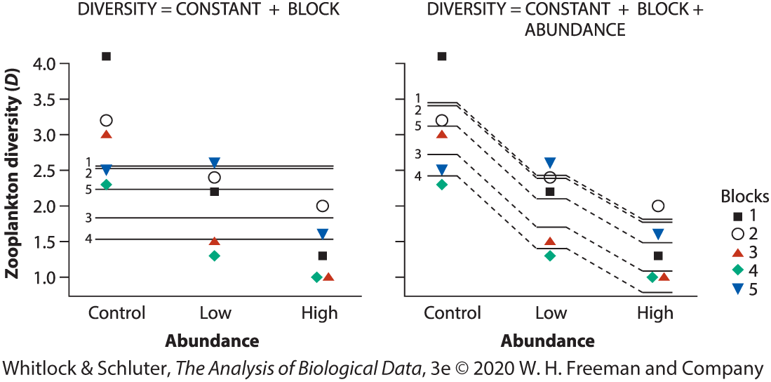
  • Predicted values suggest:

    • highest diversity in Control

    • intermediate in Low

    • lowest in High

  • More fish reduced zooplankton diversity in this experiment

Two-panel plot of zooplankton diversity by fish abundance treatment (Control, Low, High). Left panel shows the null model with separate horizontal mean lines for each of five lake locations, representing block effects only. Right panel shows the full model with predicted means that vary by treatment while retaining block differences. Symbols identify the five blocks. Diversity is generally highest in Control, intermediate in Low, and lowest in High treatments.
Figure 14: Comparison of the null model and full blocked model fitted to zooplankton diversity data. The null model includes block effects only, whereas the full model also includes fish abundance treatment. Data from Svanbäck and Bolnick (2007), as presented by Whitlock & Schluter (2020).

Important principle about blocking

  • BLOCK is included because of study design

  • It is not the main biological question

  • Keep blocking variables in the model even if not significant

  • Blocking can still improve power

Analyzing factorial designs

Factorial designs study two factors at once

  • A factorial design includes all combinations of two or more explanatory variables

  • Each explanatory variable is a factor

  • Factors are treatments of direct interest

  • Allows us to test:

    • main effects

    • interaction effects

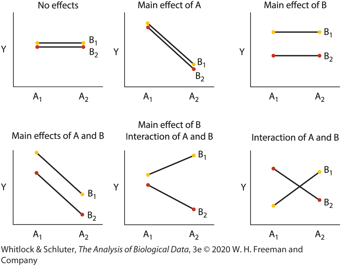
Figure 15: Interaction plots of effects in a hypothetical experiment with two factors (variables) A and B, each having two treatment categories. The title of each panel indicates which effects are present. Dots represent means. Lines connect means of each B group between different A groups. An interaction between A and B is present in the data if the lines are not parallel.

Two-factor linear model

  • General model:

\[ Y = CONSTANT + A + B + A*B \]

  • \(A\) and \(B\) are main effects terms

  • \(A*B\) is the interaction term

Figure 16: Interaction plots of effects in a hypothetical experiment with two factors (variables) A and B, each having two treatment categories. The title of each panel indicates which effects are present. Dots represent means. Lines connect means of each B group between different A groups. An interaction between A and B is present in the data if the lines are not parallel.

Main effects vs interaction

  • Main effect: average effect of one factor across levels of the other factor

  • Interaction: effect of one factor depends on the level of the other factor

  • In interaction plots:

    • parallel lines suggest no interaction

    • nonparallel lines suggest interaction
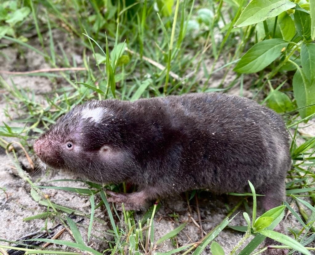
Figure 17: Interaction plots of effects in a hypothetical experiment with two factors (variables) A and B, each having two treatment categories. The title of each panel indicates which effects are present. Dots represent means. Lines connect means of each B group between different A groups. An interaction between A and B is present in the data if the lines are not parallel.

Intertidal algae experiment

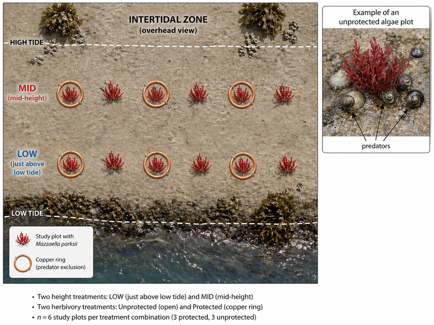
  • Researchers tested effects of herbivores on algal cover

  • Two factors:

    • Herbivory: Absent or Present

    • Height: Low or Mid intertidal zone

  • Response: square-root algal surface area

  • Balanced design with all treatment combinations

Overhead diagram of a rocky intertidal zone with dashed lines marking high tide and low tide. Six study plots are arranged at mid height between the tide lines and six plots are arranged just above the low tide line. Each plot is marked by a small red alga. Within each height treatment, three plots have copper rings around the algae indicating herbivore exclusion, and three plots have no ring. An inset shows an uncovered algae plot with limpets and snails labeled predators.
Figure 18: Study design of the intertidal algae experiment by Harley (2003), showing plots placed at two shore heights with herbivore exclusion treatments applied using copper rings.

Means suggest an interaction

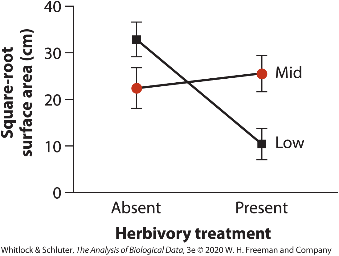
  • At low height:

    • herbivores greatly reduced algae
  • At mid height:

    • herbivory had little effect
  • Suggests herbivory effect depends on height

Interaction plot with herbivory treatment on the horizontal axis (Absent, Present) and square-root algal surface area on the vertical axis. One line for Low height declines sharply from about 33 when herbivores are absent to about 10 when present. A second line for Mid height rises slightly from about 22 to about 26. Error bars show standard errors. The nonparallel lines indicate an interaction between herbivory and height.
Figure 19: Mean algal surface area for each combination of herbivory treatment and shore height. Herbivores strongly reduced algae at low height but had little effect at mid height. Data from Harley (2003), as presented by Whitlock & Schluter (2020).

Testing the interaction first

Compare two models:

  • Without interaction:

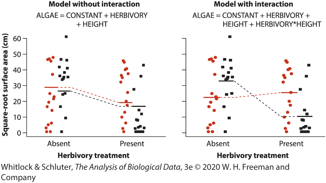
\[ \begin{aligned} \text{ALGAE} &= \text{CONSTANT} \\ &\quad + \text{HERBIVORY} \\ &\quad + \text{HEIGHT} \end{aligned} \]

  • With interaction:

\[ \begin{aligned} \text{ALGAE} &= \text{CONSTANT} \\ &\quad + \text{HERBIVORY} \\ &\quad + \text{HEIGHT} \\ &\quad + \text{HERBIVORY} * \text{HEIGHT} \end{aligned} \]

Two-panel graph of algal surface area by herbivory treatment. Left panel shows a model without interaction, where fitted lines for Low and Mid heights are parallel. Right panel shows a model with interaction, where one fitted line declines strongly and the other rises slightly, allowing different herbivory effects at different heights. Points show individual observations for the two height groups.
Figure 20: Comparison of models fitted with and without the herbivory by height interaction term. Including the interaction better captures how herbivory effects differed between shore heights. Data from Harley (2003), as presented by Whitlock & Schluter (2020).

ANOVA results

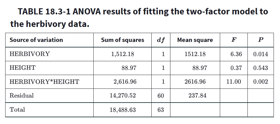
  • Interaction term was significant

    • \(F = 11.00\)

    • \(P = 0.002\)

  • Herbivory main effect also significant

  • Height main effect not significant alone

ANOVA table with rows for HEIGHT, HERBIVORY, HERBIVORY × HEIGHT, Residual, and Total. Columns include sum of squares, degrees of freedom, mean square, F statistic, and P value. HERBIVORY has a significant main effect with F = 39.08 and P < 0.0001. The interaction HERBIVORY × HEIGHT is also significant with F = 11.00 and P = 0.002, indicating that the effect of herbivory depended on shore height. HEIGHT alone is not statistically significant with P = 0.219.
Table 3: ANOVA results for the two-factor linear model testing effects of herbivory, shore height, and their interaction on algal cover. Data from Harley (2003), as presented by Whitlock & Schluter (2020).

How to interpret a significant interaction

  • Main effects alone can be misleading when interaction is present

  • Height mattered because it changed the herbivory effect

  • Use graphs to describe the biological pattern

Figure 21: Mean algal surface area for each combination of herbivory treatment and shore height. Herbivores strongly reduced algae at low height but had little effect at mid height. Data from Harley (2003), as presented by Whitlock & Schluter (2020).

Biological conclusion

  • Herbivores strongly reduced algae at low height

  • Herbivores had weaker effect at mid height

  • Treatment effects depended on environmental context

Photograph of a rocky ocean shoreline at low tide with waves in the background and wet exposed bedrock in the foreground. Reddish patches of Mazzaella parksii algae are visible attached to the rock surface in bands and clumps. Tide pools and dark seaweed patches are scattered across the shore under a cloudy sky.
Figure 22: Mazzaella parksii exposed on a rocky intertidal shore at low tide. The photograph illustrates the type of habitat used in Harley’s (2003) experiment. Photo: © Carita Bergman (CC BY-NC-ND 4.0)

Points to remember about factorial designs

  • Factorial designs test multiple factors simultaneously
  • Always examine the interaction first
  • Nonparallel lines often indicate interaction
  • Graphs are essential for interpretation

Adjusting for the effects of a covariate

Analysis of covariance (ANCOVA)

  • Individuals differ in an important numerical variable
  • That variable may also differ on average between groups
  • This can confound comparisons between groups
  • ANCOVA combines:
    • regression for a numerical covariate
    • comparison of a categorical group factor

\[ \begin{aligned} \text{RESPONSE} &= \text{CONSTANT} \\ &\quad + \text{COVARIATE} \\ &\quad + \text{TREATMENT} \end{aligned} \]

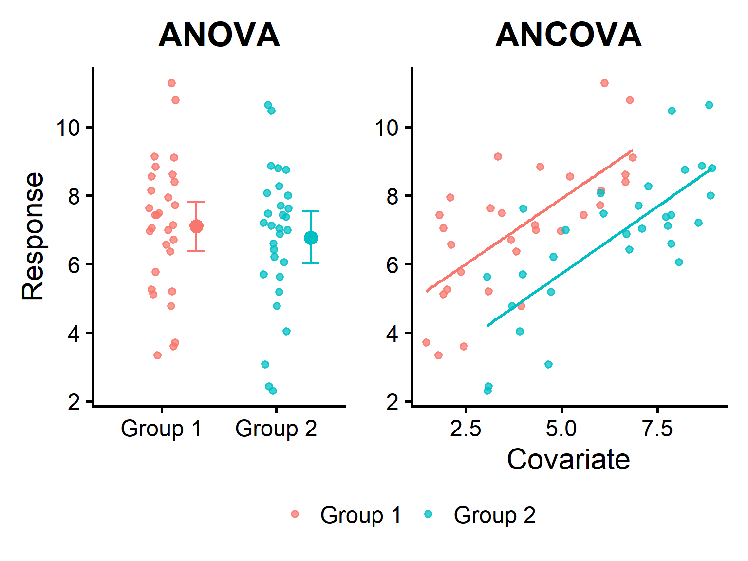
Two-panel figure based on the same simulated data. Left panel, labeled ANOVA, shows a jitterplot of two groups with similar sample means and overlapping confidence intervals. Right panel, labeled ANCOVA, shows the same observations as a scatterplot with a numerical covariate on the horizontal axis and response on the vertical axis. Separate fitted regression lines are parallel, with one group consistently higher than the other after adjustment for the covariate.
Figure 23: Comparison of ANOVA and ANCOVA using the same simulated dataset. A simple comparison of group means suggests little difference, but after adjusting for a numerical covariate, Group 1 has a higher expected response than Group 2 for a given value of the covariate.

A common two-step ANCOVA strategy

Step 1: Test for interaction

\[ \begin{aligned} \text{RESPONSE} &= \text{CONSTANT} \\ &\quad + \text{COVARIATE} \\ &\quad + \text{TREATMENT} \\ &\quad + \text{COVARIATE} * \text{TREATMENT} \end{aligned} \]

Step 2: If interaction is weak, simplify

\[ \begin{aligned} \text{RESPONSE} &= \text{CONSTANT} \\ &\quad + \text{COVARIATE} \\ &\quad + \text{TREATMENT} \end{aligned} \]

  • Ask whether slopes differ among groups
  • If interaction is important, treatment effects depend on covariate value

  • Use graphs to interpret the pattern

  • Assume similar slopes across groups

  • Compare groups after adjusting for the covariate

  • Estimate the treatment effect more simply

  • Failing to reject the interaction does not prove it is absent

  • Use biological judgment and graphs, not only p-values

Example: Mole rat energy budgets

  • Scantlebury et al. (2006) compared two apparent castes of workers

    • Frequent workers

    • Infrequent workers

  • Response: daily energy expenditure

  • Covariate: body mass

    • heavier animals use more energy

    • Infrequent workers are generally heavier

  • For a given body mass, do infrequent workers have lower energy expenditure?

Damara Molerat (Fukomys damarensis), Botswana. Image © Robert Taylor (CC BY 4.0).

Damara Molerat (Fukomys damarensis), Botswana. Image © Robert Taylor (CC BY 4.0).

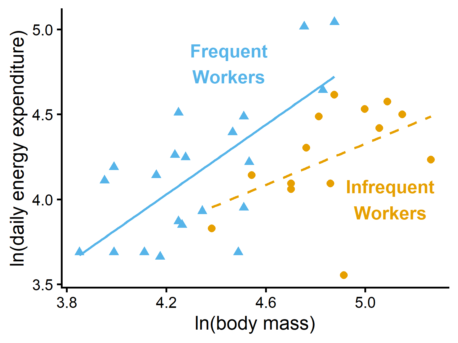
Full model with interaction

\[ \begin{aligned} \text{ENERGY} &= \text{CONSTANT} \\ &\quad + \text{CASTE} \\ &\quad + \text{MASS} \\ &\quad + \text{CASTE} * \text{MASS} \end{aligned} \]

  • Separate regression lines for each caste

  • Interaction tests whether slopes differ

Scatterplot of log body mass on the horizontal axis and log daily energy expenditure on the vertical axis for two mole-rat worker castes. Open circles with a dashed regression line represent frequent workers, and filled red circles with a solid regression line represent infrequent workers. The two fitted lines have different slopes, illustrating the interaction model in which the relationship between mass and energy expenditure may differ by caste.
Figure 24: Daily energy expenditure of Damaraland mole rats in two worker castes plotted against body mass. Separate regression lines from the full ANCOVA model include a CASTE × MASS interaction, allowing slopes to differ between frequent workers and infrequent workers.

First question: are slopes different?

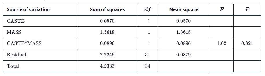
  • Test the interaction term first: do slopes differ among castes?

    • \(H_0\) : slopes are equal

    • \(H_A\) : slopes differ

  • CASTE × MASS: ( \(F=1.02\) ; \(P=0.321\) )

  • Little evidence that slopes differ

  • Parallel slopes are a reasonable simplification

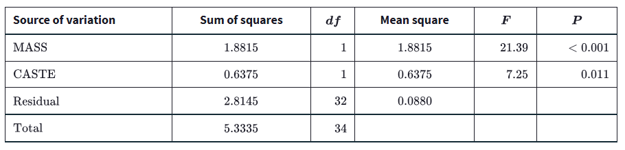
Table 4: ANOVA table for the linear model fitted to the mole-rat data. We test only the interaction term in this round.

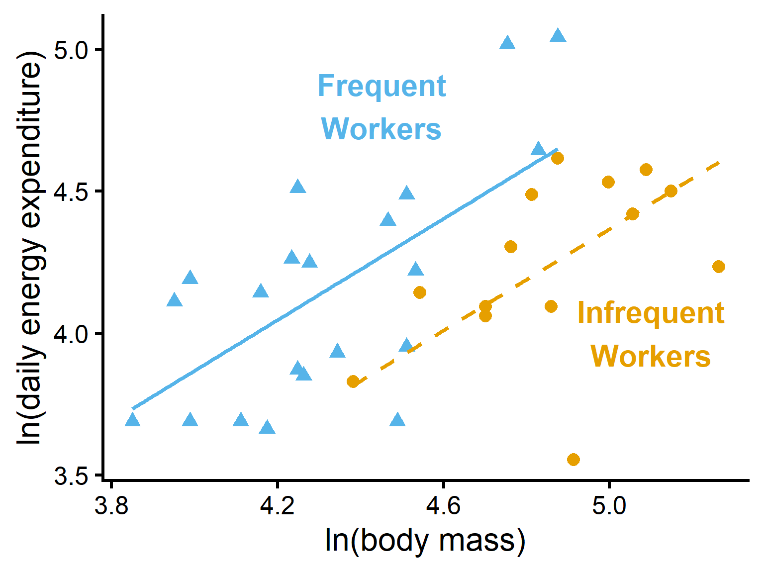
Refit model without interaction

\[ \begin{aligned} \text{ENERGY} &= \text{CONSTANT} \\ &\quad + \text{CASTE} \\ &\quad + \text{MASS} \end{aligned} \]

  • Same slope for both castes

  • Different intercepts allowed

Scatterplot of log body mass on the horizontal axis and log daily energy expenditure on the vertical axis for two mole-rat worker castes. Points are colored by caste. Two fitted regression lines are shown with the same positive slope, indicating equal relationships between mass and energy expenditure, but one line is consistently higher than the other, indicating a caste difference after adjusting for body mass.
Figure 25: Daily energy expenditure of Damaraland mole rats in two worker castes plotted against body mass. Regression lines from the simplified ANCOVA model omit the CASTE × MASS interaction, so both castes are modeled with parallel slopes but different intercepts.

Results from the simplified model

  • Test CASTE after accounting for MASS

  • CASTE: \(F = 7.25,\; P = 0.011\)

    • Worker castes differed in energy expenditure after adjusting for body mass
  • MASS: \(F = 21.39,\; P < 0.001\)

    • Larger mole rats used more energy
Table 5: ANOVA table for the linear model without an interaction term fitted to the mole-rat data.

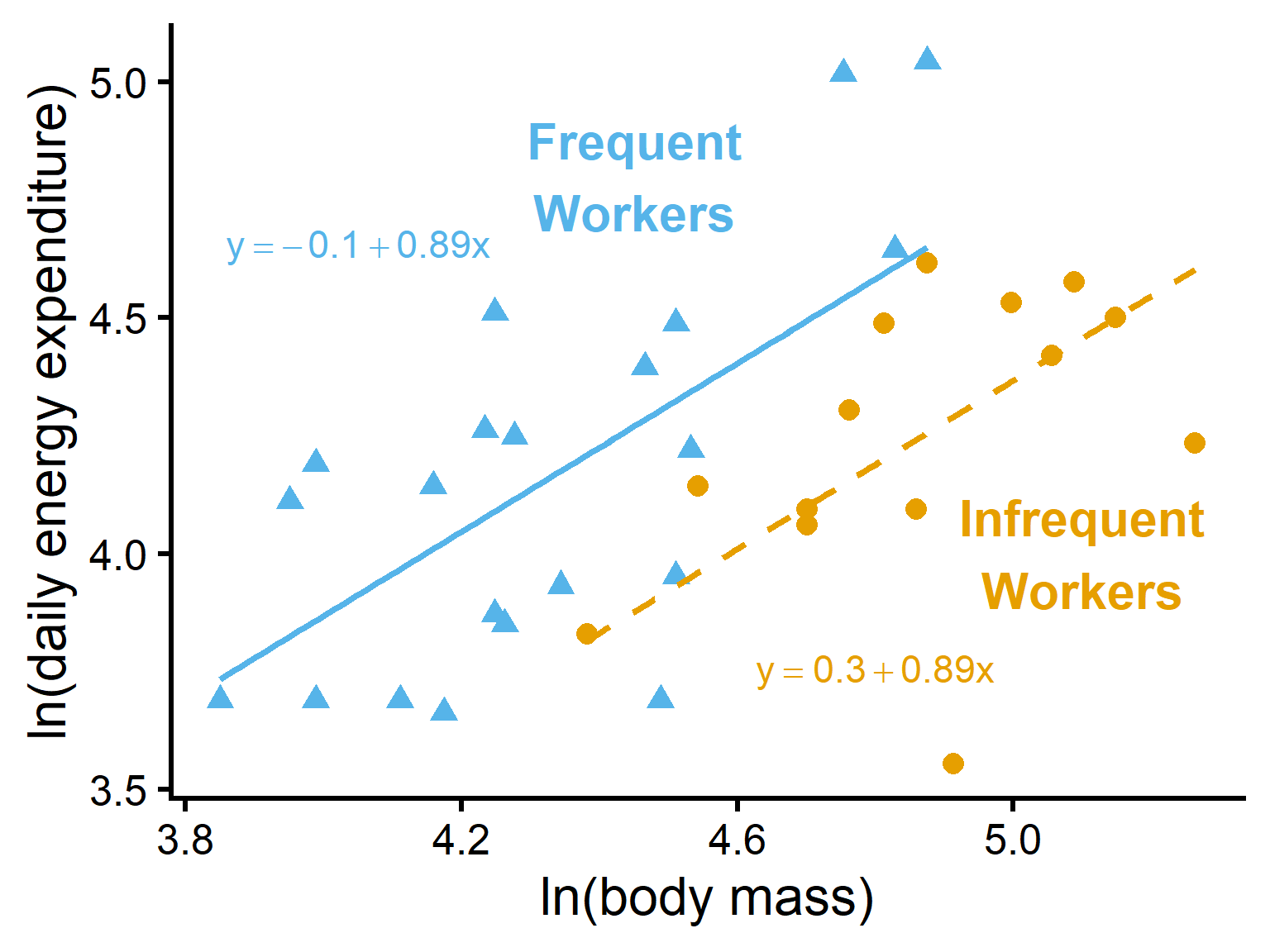
Biological conclusion: castes varied in baseline energy use

  • Caste effect = vertical gap between lines
  • After adjusting for body mass:
    • Frequent workers had ~ 0.39 higher ln(daily energy expenditure)
    • In original units: ~ 48% higher daily energy expenditure
  • Biological interpretation suggested by Scantlebury et al. (2006):
    • Frequent workers contribute to colony work, help queen reproduce
    • Infrequent workers build up own body reserves in preparation for rare rain events that soften soil, allow for dispersal (digging new tunnels) and reproduction
Scatterplot of log body mass versus log daily energy expenditure for two mole-rat worker castes. Blue triangles represent the Worker caste and orange circles represent the Lazy caste. Two fitted regression lines are parallel with the same positive slope, but the blue Worker line is consistently higher than the orange Lazy line. Equations are shown for each line with different intercepts and identical slopes, illustrating that caste changes the intercept while body mass determines the common slope.
Figure 26: Estimated relationships between body mass and daily energy expenditure for two mole-rat worker castes under the simplified ANCOVA model. The lines have the same slope but different y-intercepts, indicating a constant caste effect across body sizes. This vertical separation between lines is the estimated effect size of caste after adjusting for body mass.

Important caution

  • ANCOVA adjusts statistically, not experimentally

  • Other unmeasured confounders may remain

  • Association does not guarantee causation

Take-home point

  • ANCOVA combines regression and group comparison

  • Test interaction first

  • If slopes are similar, compare adjusted group means

Assumptions of linear models

Assumptions of linear models

  • Linear models use the same core assumptions as regression and ANOVA

  • Observations are independent random samples

  • Residuals are approximately normal

  • Variance is similar across groups or fitted values

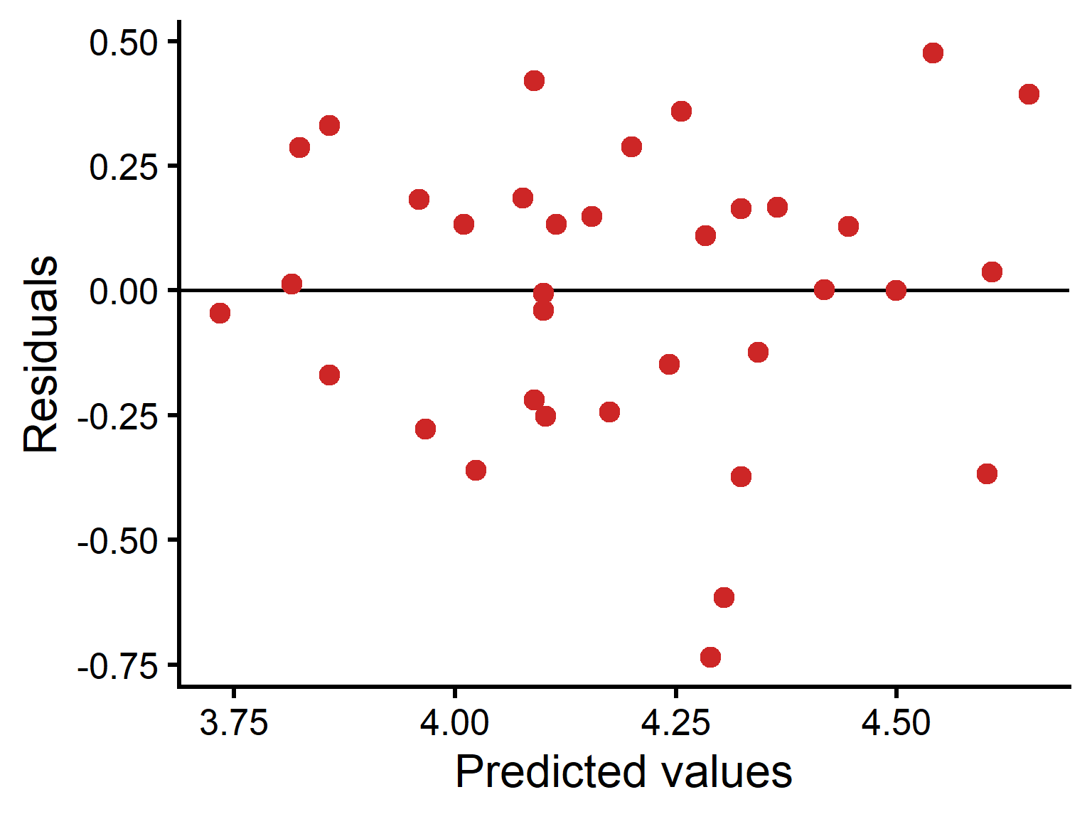
Residual plot: mole-rat example

  • Residuals are checked the same way as in regression

  • Plot residuals against predicted values

  • A good plot shows:

    • points centered around zero

    • similar spread across fitted values

    • no strong curve or pattern

  • This example looks reasonably acceptable, with one or two possible outliers

Scatterplot of predicted values on the horizontal axis and residuals on the vertical axis for the simplified mole-rat ANCOVA model. A horizontal line marks zero residual. Points are scattered above and below zero across the range of fitted values with fairly similar spread, though one or two points have relatively large negative residuals.
Figure 27: Residual plot for the simplified ANCOVA model fitted to the mole-rat data. Residuals are scattered around zero with no strong pattern, suggesting the model assumptions are reasonably met.

If assumptions are violated

  • Consider transforming the response variable

  • Check influential outliers

  • Reconsider model form

  • Use alternative methods if needed