Overview
When creating a poster in PowerPoint, figures should be designed and exported from R at their final size rather than resized later.
This requires a deliberate workflow that controls both the appearance of the plot and how it is saved.
- Create figures using
ggplot2
- Use a large base font size suitable for posters
- Export figures with
ggsave() using fixed dimensions (in inches)
- Insert into PowerPoint without major resizing
This produces figures that are readable, properly scaled, and consistent across the poster.
The Problem
A common issue is getting a figure from R into PowerPoint that is actually readable on a poster.
Many students use approaches that seem convenient but produce poor results:
- copying a figure from the Plots tab in RStudio
- using the Export button in the Plots tab adjusting image size and font size
- taking a screenshot of the graph
These approaches do not preserve control over:
- figure size
- text size
- resolution
- aspect ratio (length to width ratio)
As a result, when the figure is placed into PowerPoint and resized:
- text becomes too small to read
- images appear blurry or pixelated
- plots become stretched or distorted
- facet panels become cramped
- figures look inconsistent across the poster
General Approach
The solution is to design and export figures in R at the exact size they will appear in PowerPoint.
This means:
- deciding how much space the figure will occupy (e.g., half-column or full-column)
- setting text size appropriate for poster viewing
- exporting the image with fixed width and height in inches
- avoiding major resizing after insertion into PowerPoint
This approach ensures:
- readable text
- clean image quality
- correct proportions
- consistent layout across figures
Recommended workflow
1. Create and store the graph
- Use
ggplot2 to build your figure
- Assign the plot to an object using a descriptive name (e.g.,
penguin_scatter)
- Build the full plot before saving (do not rely on the last displayed plot)
- Use clear, consistent naming for figure objects
- Preview the plot in RStudio to check appearance before exporting
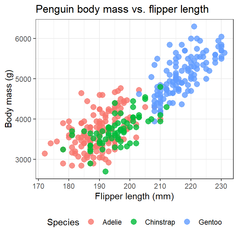
2. Choose a theme and set base_size = 20
- Start with your existing plot object (e.g.,
penguin_scatter)
- Add a theme layer with an appropriate base size, and assign the result to a new object (e.g.,
fig1)
- Example:
fig1 <- penguin_scatter + theme_minimal(base_size = 20)
- This ensures:
- the plot is readable in the RStudio Plots tab
- the saved image will also have appropriately sized text for a poster
- Recommended theme options:
theme_minimal(base_size = 20)theme_bw(base_size = 20)theme_classic(base_size = 20)theme_light(base_size = 20)
- The
base_size setting controls most text, including:
- axis titles and labels
- legend text
- facet labels
- Adjust other visual elements directly in geoms as needed:
- point size →
geom_point(size = ...)
- line width →
geom_line(linewidth = ...)
- text labels →
geom_text(size = ...), geom_label(size = ...)
3. Export with ggsave()
- Use
ggsave() to save your figure as a PNG file
- Include the following arguments:
-
filename = (name of the output file, e.g., "penguin_scatter.png")
-
plot = (the plot object, e.g., fig1)
-
width = (in inches)
-
height = (in inches)
units = "in"
- Choose width based on how the figure will be used in PowerPoint:
- full-column figure:
width = 13.5
- half-column figure:
width = 6 to 7
- Set height intentionally based on the content:
- adjust to maintain good proportions
- ensure text, points, and facets are not crowded
- there is no single correct value; expect to iterate
- Use PNG format for clean, high-quality images suitable for posters
4. Open and inspect the saved file
- Go to the Files tab in RStudio
- Locate the exported image file (e.g.,
"penguin_scatter.png")
- Click the file to open it
- Check the figure carefully:
- text size is readable
- points and lines are appropriately sized
- nothing looks crowded or cut off
- proportions look correct (not stretched)
- If the figure does not look right:
- adjust width and/or height in
ggsave()
- revise theme or geom sizes as needed
- re-save and check again
5. Insert the image into PowerPoint
- In RStudio, go to the Files tab
- Check the box next to your image file (e.g.,
"penguin_scatter.png")
- Click More → Export…
- Save the file (typically to your Downloads folder)
- In PowerPoint:
- Go to Insert → Pictures → This Device
- Navigate to your Downloads folder
- Select the image and insert it
- After inserting:
- avoid large resizing (especially enlarging)
- position the image in its intended space on the poster
Examples
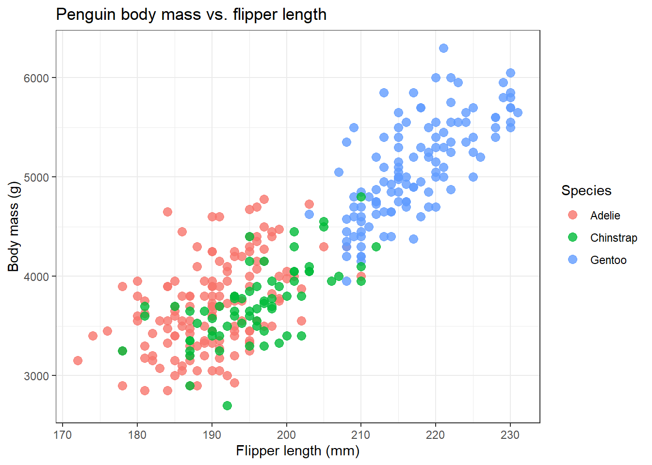
The example below uses the penguins dataset from the palmerpenguins package.
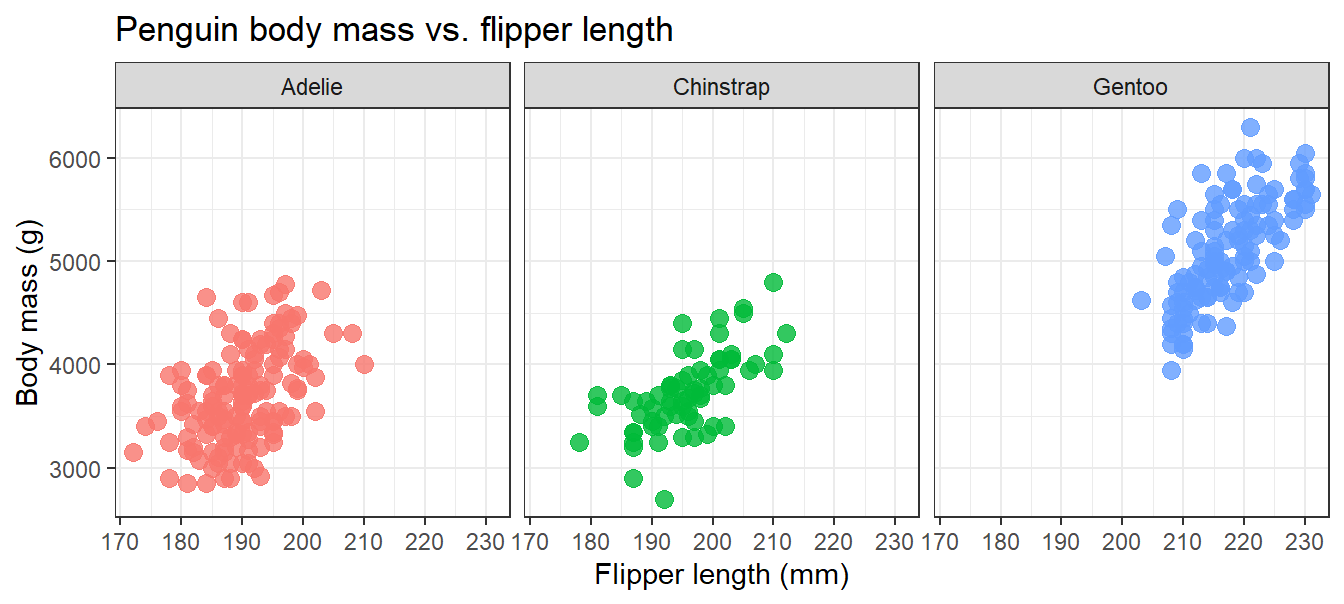
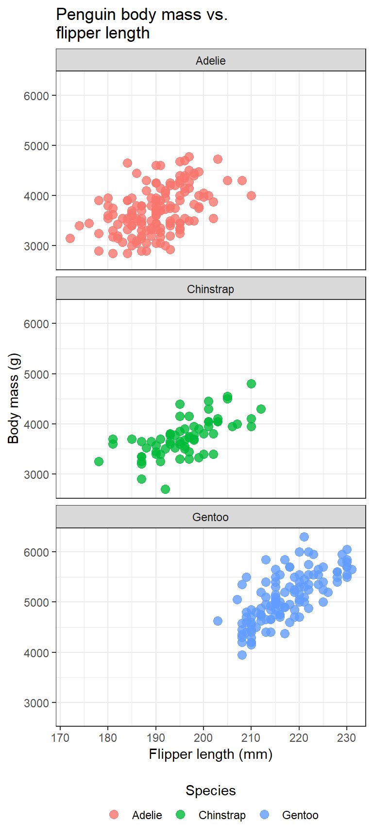
Facetted graphs
- Facetted plots require additional layout control to remain readable on a poster
- Use
facet_wrap() with the ncol argument to control the number of columns
- Adjust
ncol based on the width of the figure:
- half-column figure:
- full-column figure:
- Choose a layout that:
- keeps each panel large enough to read
- avoids overcrowding
- makes efficient use of available space
- The best choice depends on:
- the type of plot
- the number of facets
- how much detail each panel contains
- Expect to adjust both
ncol and figure height to get a clean result